Volt Design System
Lead designer across two embedded product teams that were quietly diverging. I built the system that unified them: 1,121 component sets serving Small Commercial and Residential across three platforms.
David Energy
Principal Designer
2023
Design Systems
David Energy ran two products, Small Commercial and Residential, off one engineering team. I was the lead designer on both, so I felt the divergence from the inside: the same button, the same card, the same chart, each solved a little differently depending on which team had built it last. Nobody had decided to drift apart. It just happened, one reasonable shortcut at a time. Volt was the system I built to stop it, and it started as my initiative, not an assignment.
Two products, one engineering team, three surfaces
David Energy was scaling, and the cracks were starting to cost real time. Small Commercial and Residential shared an engineering team but had grown their interfaces independently across three surfaces: web, mobile, and the Residential app. The result was duplicated components built slightly differently, competing spacing and color decisions, and engineers reconciling those differences instead of shipping features.
Engineering already had a Storybook setup in place. So this was never a greenfield system. It was a question of taking what existed and giving it a spine.
How Volt actually started
I was embedded across both teams on an ongoing basis, which is the only reason I could see the problem clearly. Sitting in two unrelated products at once, the divergence wasn’t abstract to me. It was something I hit every week.
So I started it myself. I went to the lead engineer on one team, scoped what a shared system would take, and built enough of it to be credible. Then I took it to the PMs and got buy-in to make it the standard across both teams. Unifying two teams that touch completely different problems is as much an organizational move as a design one, and treating it that way is what got it adopted instead of shelved.
Build on Storybook, not over it
The obvious version of this project is a brand-new system that everyone migrates to. I chose the opposite. Engineering had already invested in Storybook, so I adapted what they had rather than replacing it. Meeting engineers where they already worked meant adoption was a continuation of their workflow, not a tax on it, and the political cost of “throw out your setup” never came up. The fastest system to adopt is the one that doesn’t ask people to start over.
Two-tier tokens, not three
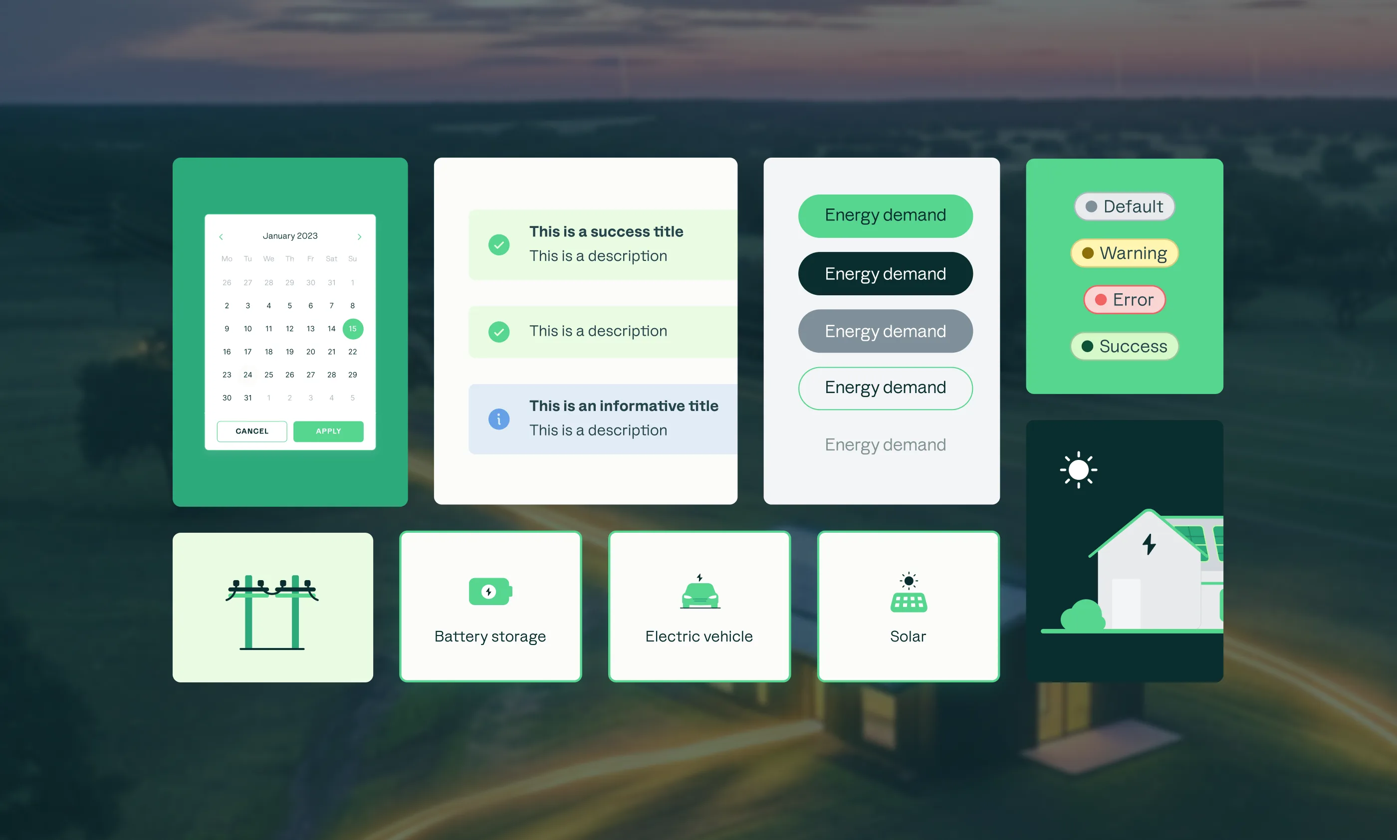
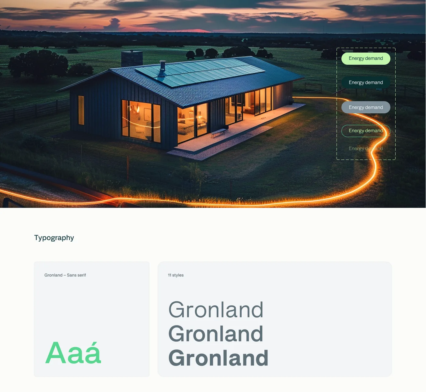
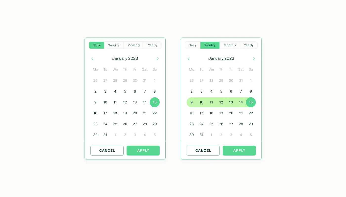
Everything in Volt starts at the token level: colors, spacing, and type defined as primitives that both products reference, so a brand update cascades automatically instead of requiring a manual sweep.
The more sophisticated-looking move is a three-tier token model, primitive to semantic to component. I deliberately stopped at two. The system wasn’t complex enough to earn a third layer, and adding one would have bought abstraction we’d pay for on every lookup without getting anything back. That call came from understanding how engineering would actually consume the tokens, not from how the architecture would look in a diagram. Restraint was the right answer, and knowing where to stop is the part that’s easy to get wrong.
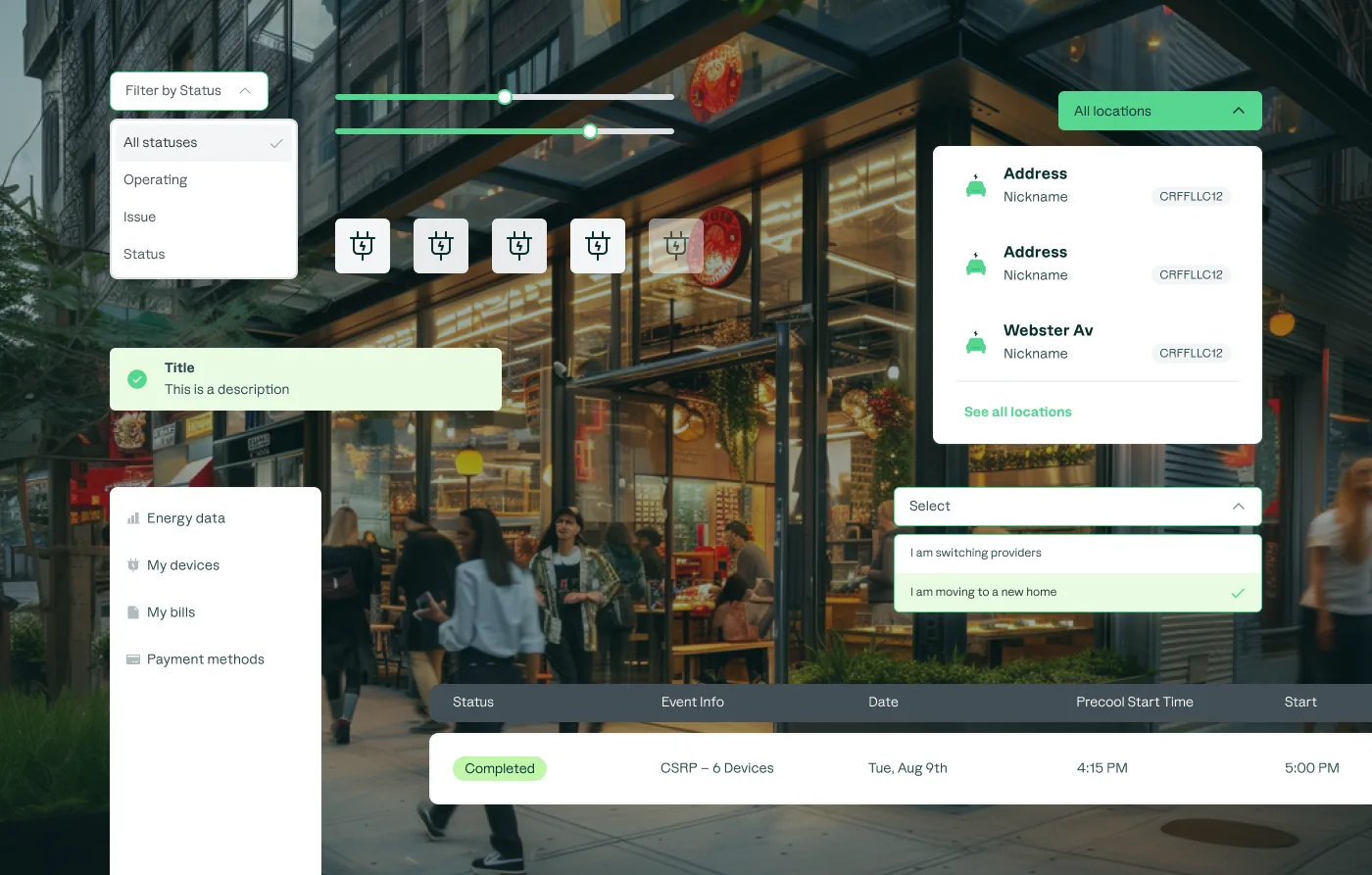
One system, two teams, three platforms
The point of the primitives was reach. The same tokens and components had to hold up across Small Commercial and Residential, and across web, mobile, and the Residential app, without forking into platform-specific variants that would quietly diverge again. I built the library so a pattern is authored once and consumed everywhere, which is what turned consistency from a thing we policed into a thing the system enforced.
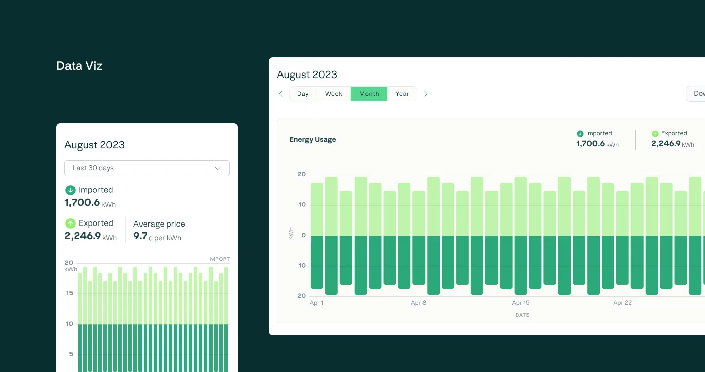
Component sets, grouping 12,164 variants across both products
The system at work
Volt shipped across both product lines. Engineers built each pattern once, and I could spend my time on the complex flows instead of re-solving basic UI for the second time in a different product.

Outcome
1,121 component sets across two product teams and three platforms. A single source of truth that ended the divergence between Small Commercial and Residential and let both teams ship faster and more consistently.
Volt became the single source of truth for two products that had been drifting apart. 1,121 component sets, grouping 12,164 variants, served Small Commercial and Residential across web, mobile, and the Residential app. The divergence that used to cost engineering time reconciling differences was gone, because there was one place a pattern lived and one place it changed. Building on the Storybook setup engineering already had meant adoption stuck, and stopping the token system at two tiers kept it fast to work in rather than impressive to diagram.