Volley Automation
Three connected digital products for a robotics parking company, plus a white-label system that cut client onboarding from weeks to hours.
Volley
Product Designer
2023-2024
Product Design · Design Systems
Volley uses robots to park cars. I designed the three digital products that make that possible — for drivers, garage operators, and Volley’s clients. Then I built the library architecture that lets the sales team deploy a fully branded suite in hours instead of weeks.
Three products, one system. We built the mobile app, kiosk, and operator dashboard as a connected suite — then designed the white-label architecture that made the whole thing scalable.
Automated parking is a trust problem
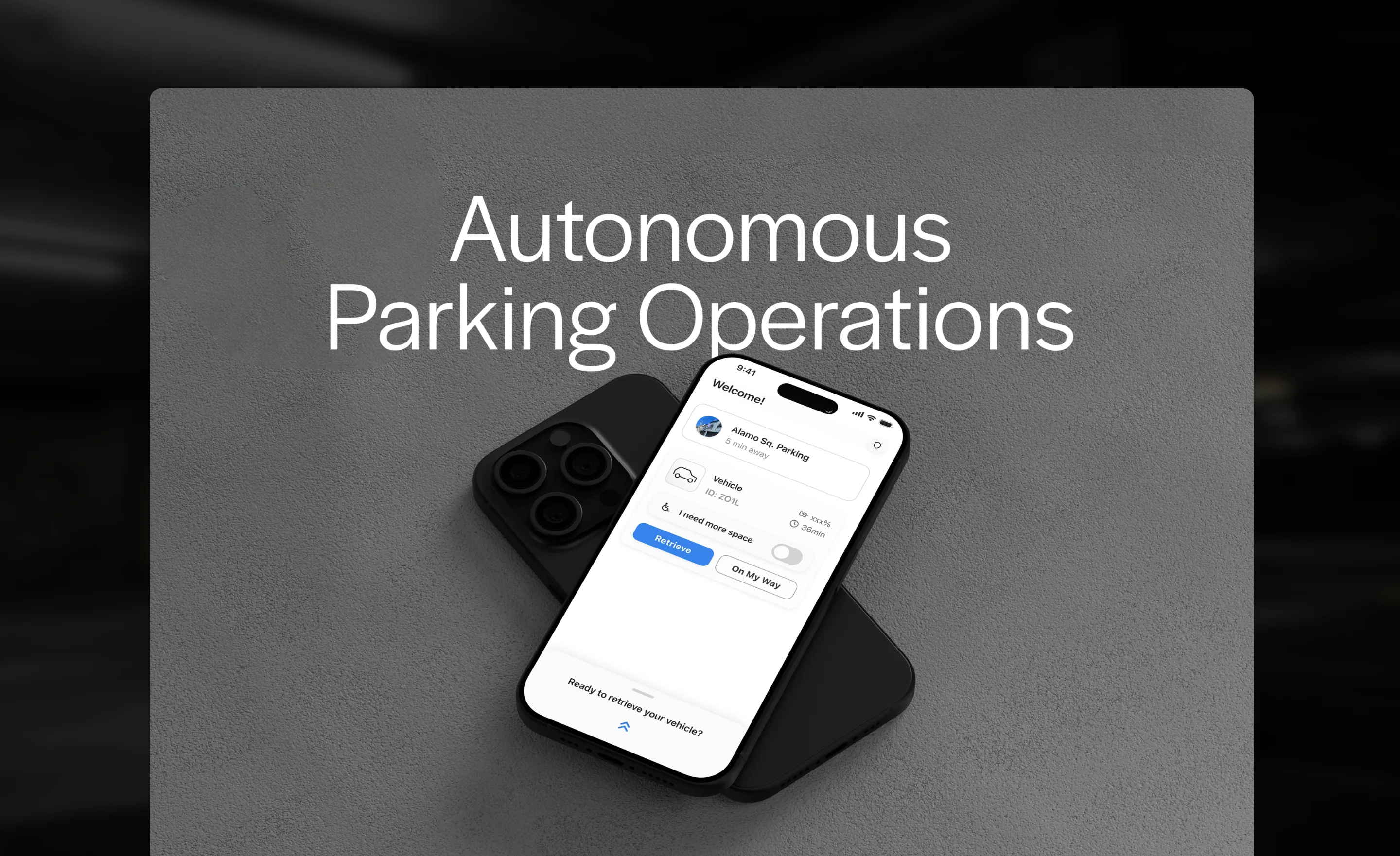
A driver pulls into a garage, hands over their keys to a machine, and walks away. The digital interface is the only thing standing between confidence and anxiety.
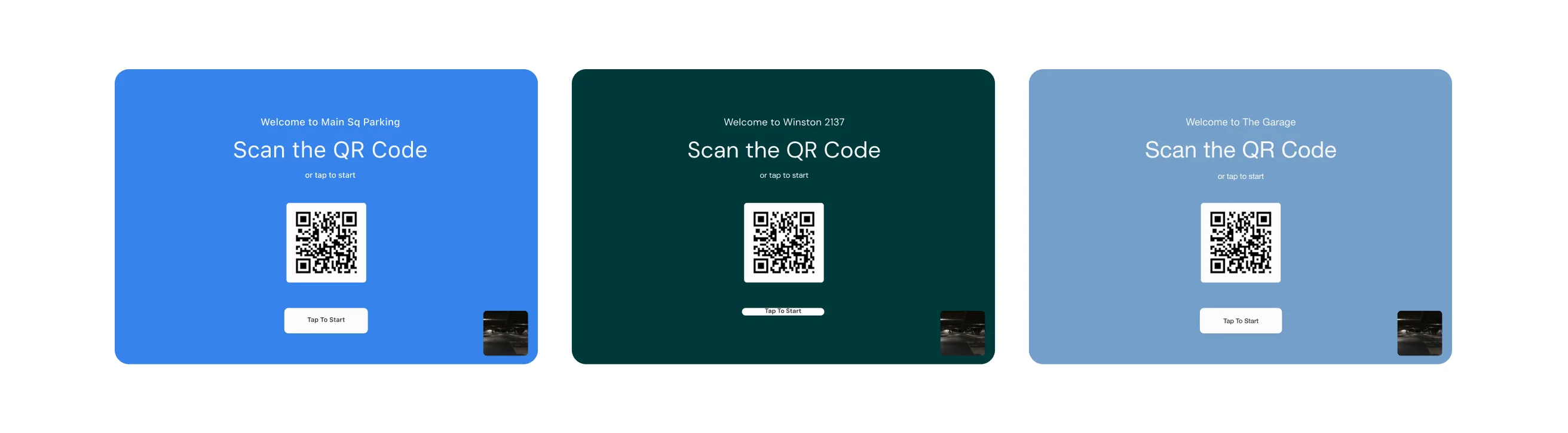
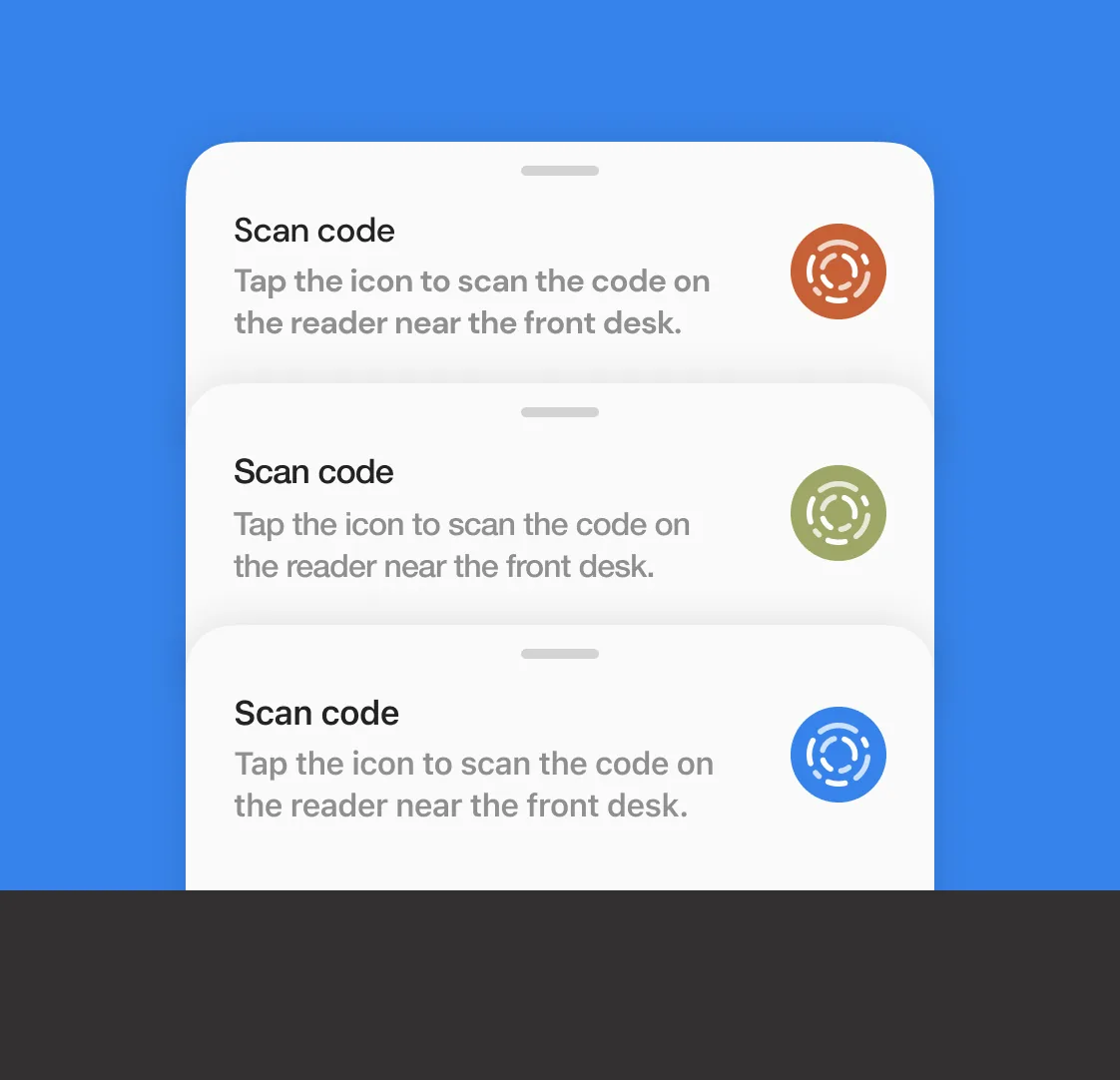
Volley needed three products: a mobile app for drivers who prefer their phone, a physical kiosk for those who don’t, and a real-time dashboard for the attendants who keep the robots running. All three had to be white-label — not a logo swap on a template, but genuine brand customization that made each client’s installation feel native to their brand.
The constraint that shaped everything: these products had to work as a system while remaining independently deployable for clients with different needs.
Speed and reassurance in every tap
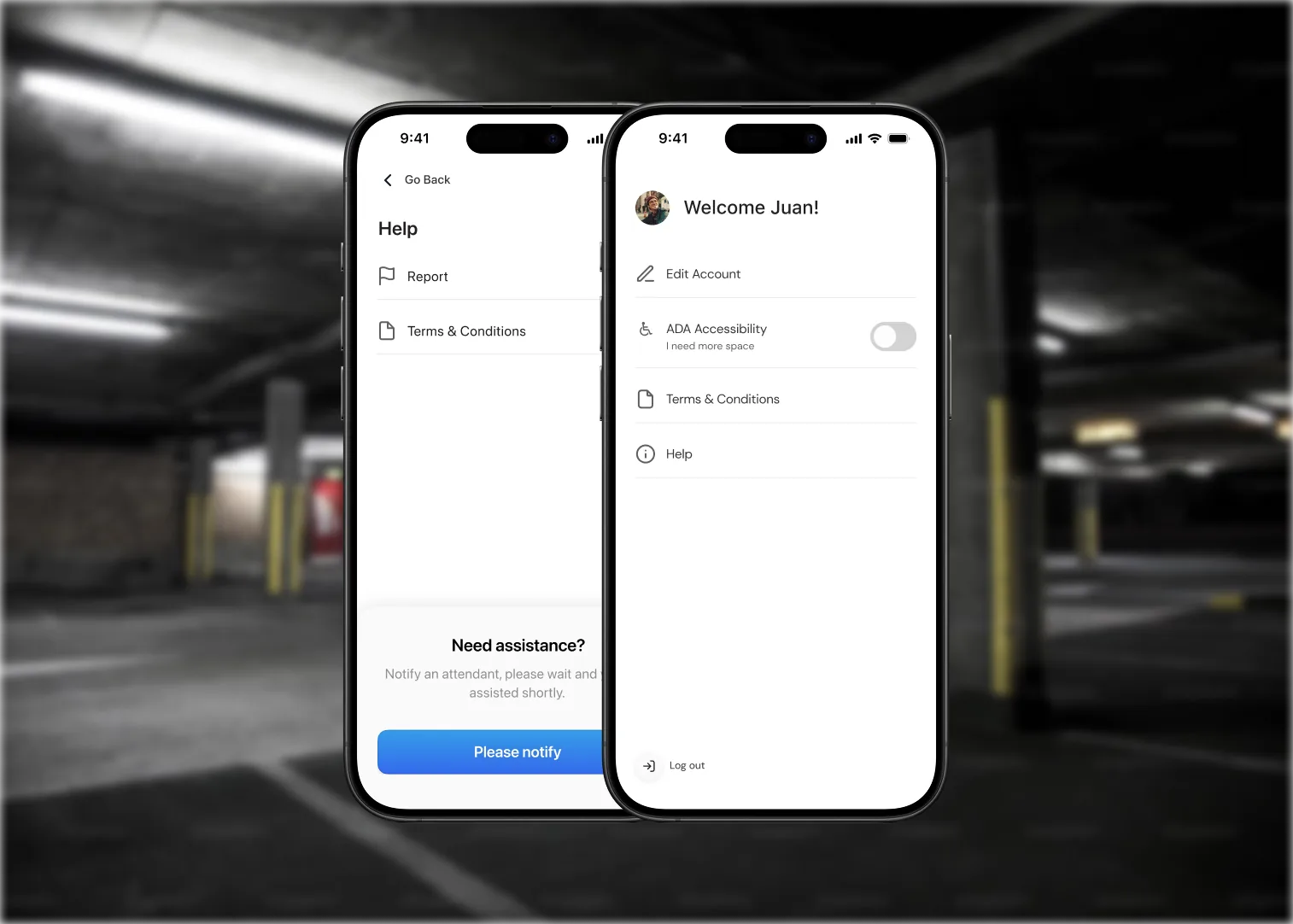
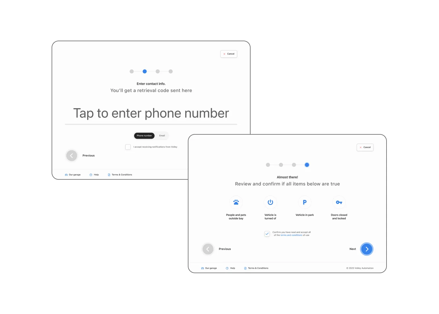
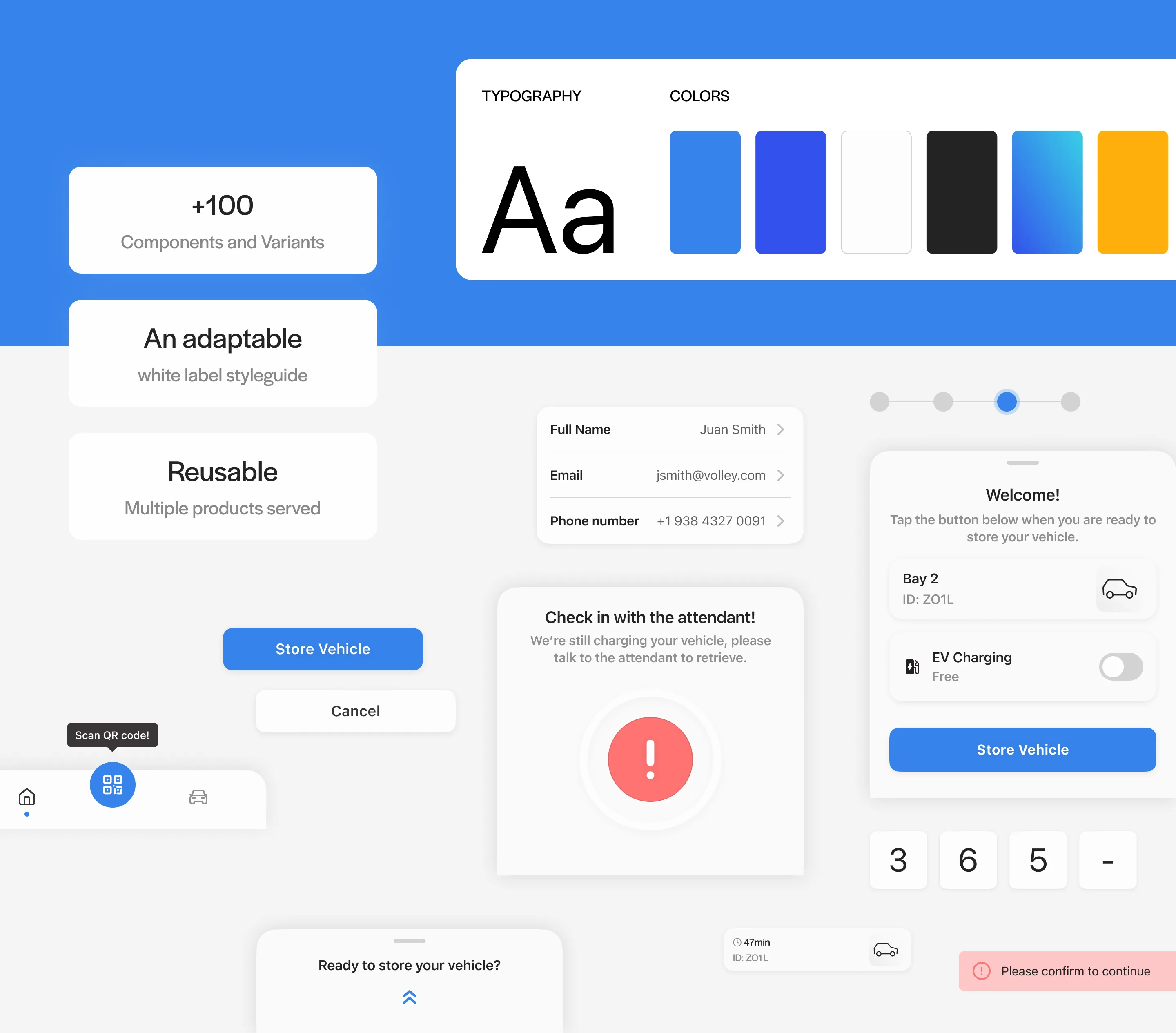
The app optimized for one thing: making a driver feel safe handing their car to a robot. Large type, minimal steps, obvious actions. No scrolling. No ambiguity about what happens next. A first-time user can store their car in three taps.
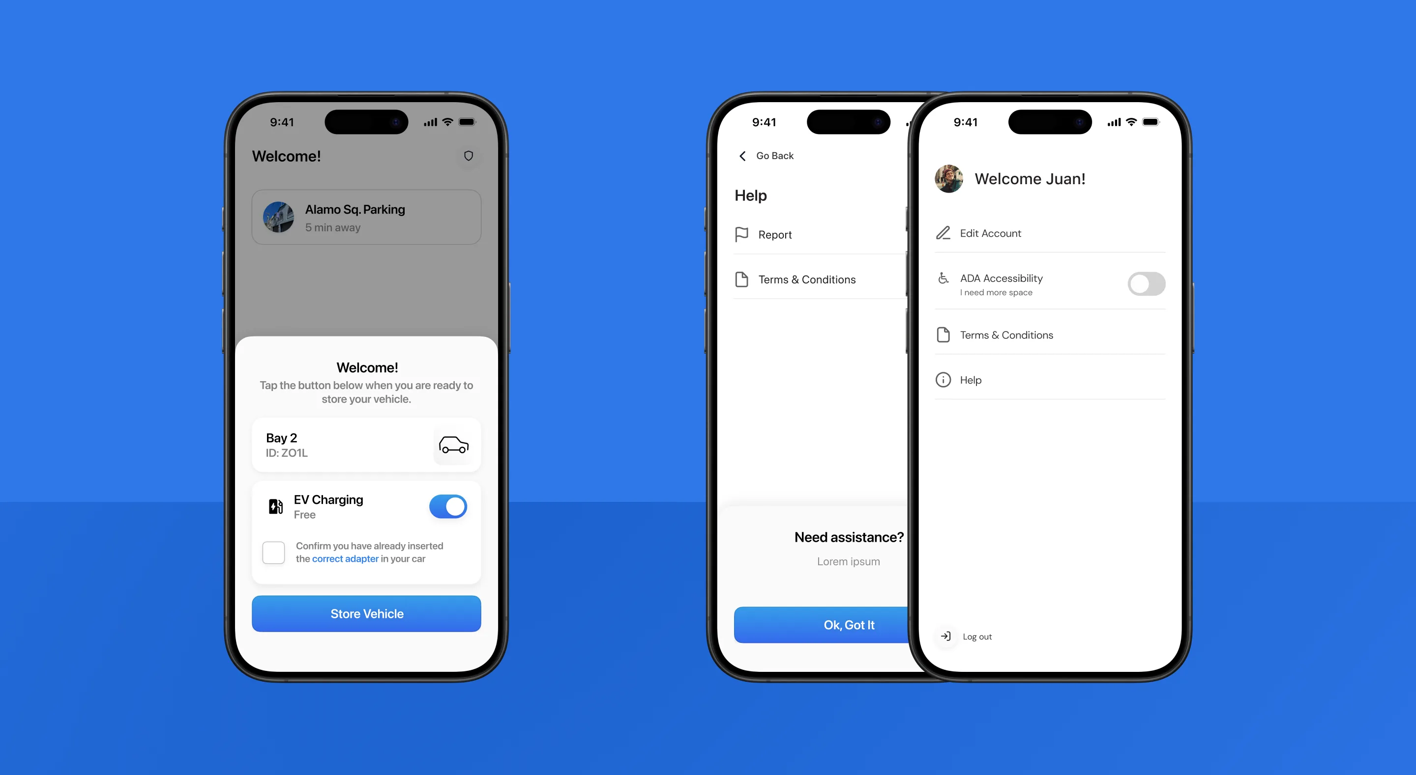
The app also handles the moments that break trust: error states, “check in with the attendant” messages, ADA accessibility modes. Every edge case was designed, not left to engineering defaults.
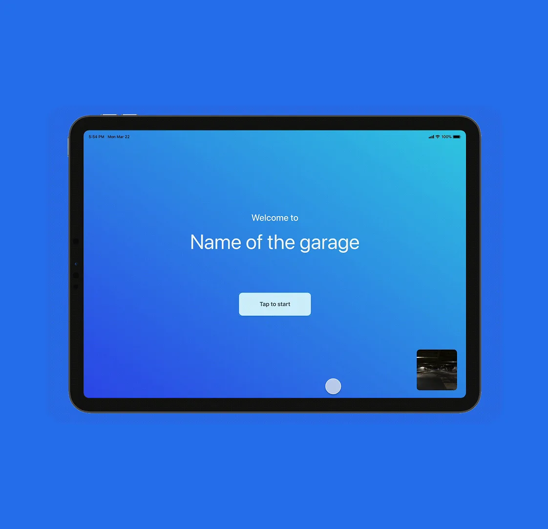
A complete experience for drivers without a phone
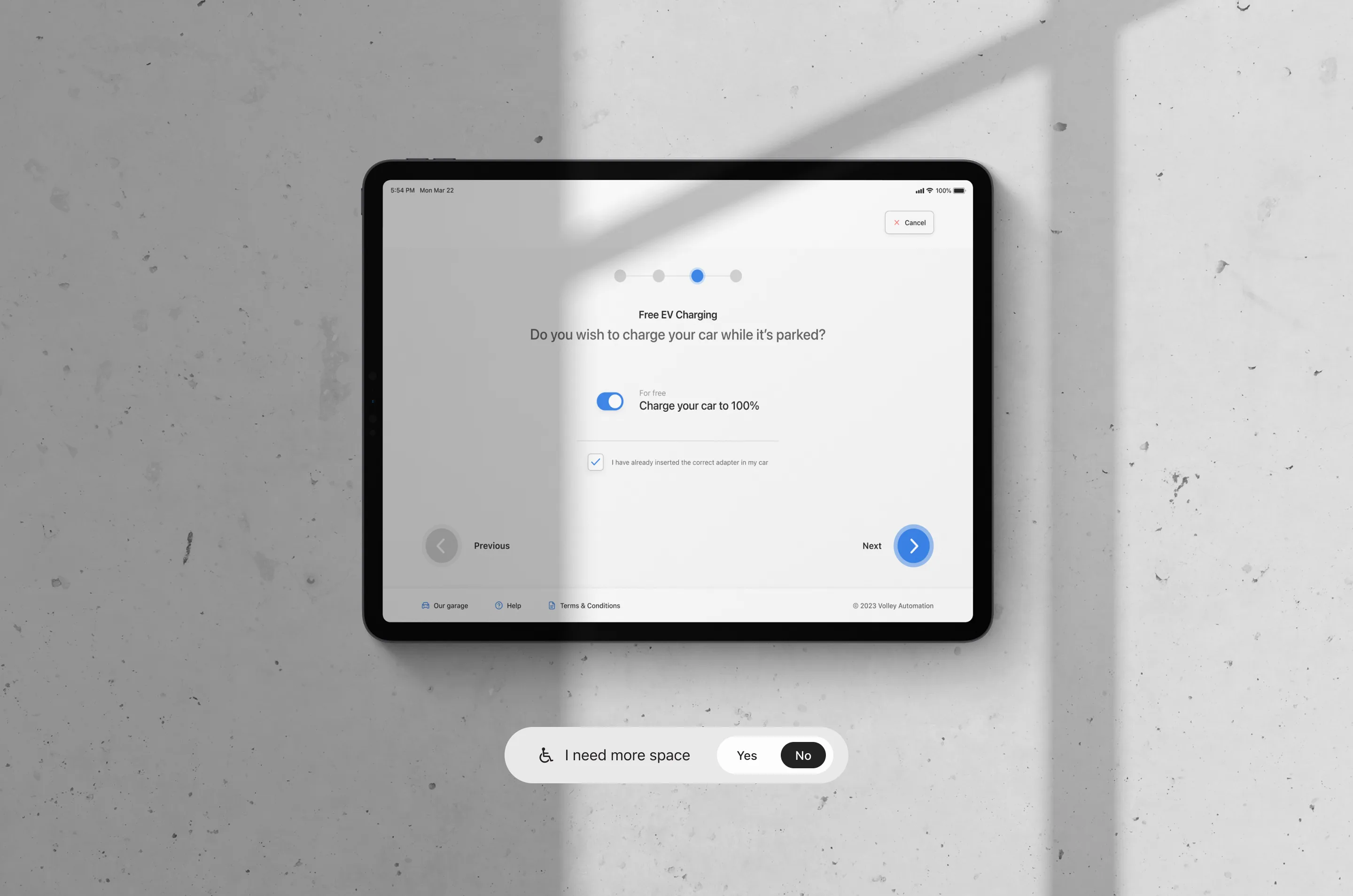
The kiosk introduced a hardware constraint most digital designers never face: the interface had to be a complete, standalone experience — not a stripped-down fallback. Tap targets sized for real fingers under real garage lighting. A flow that works for a first-timer without any explanation.
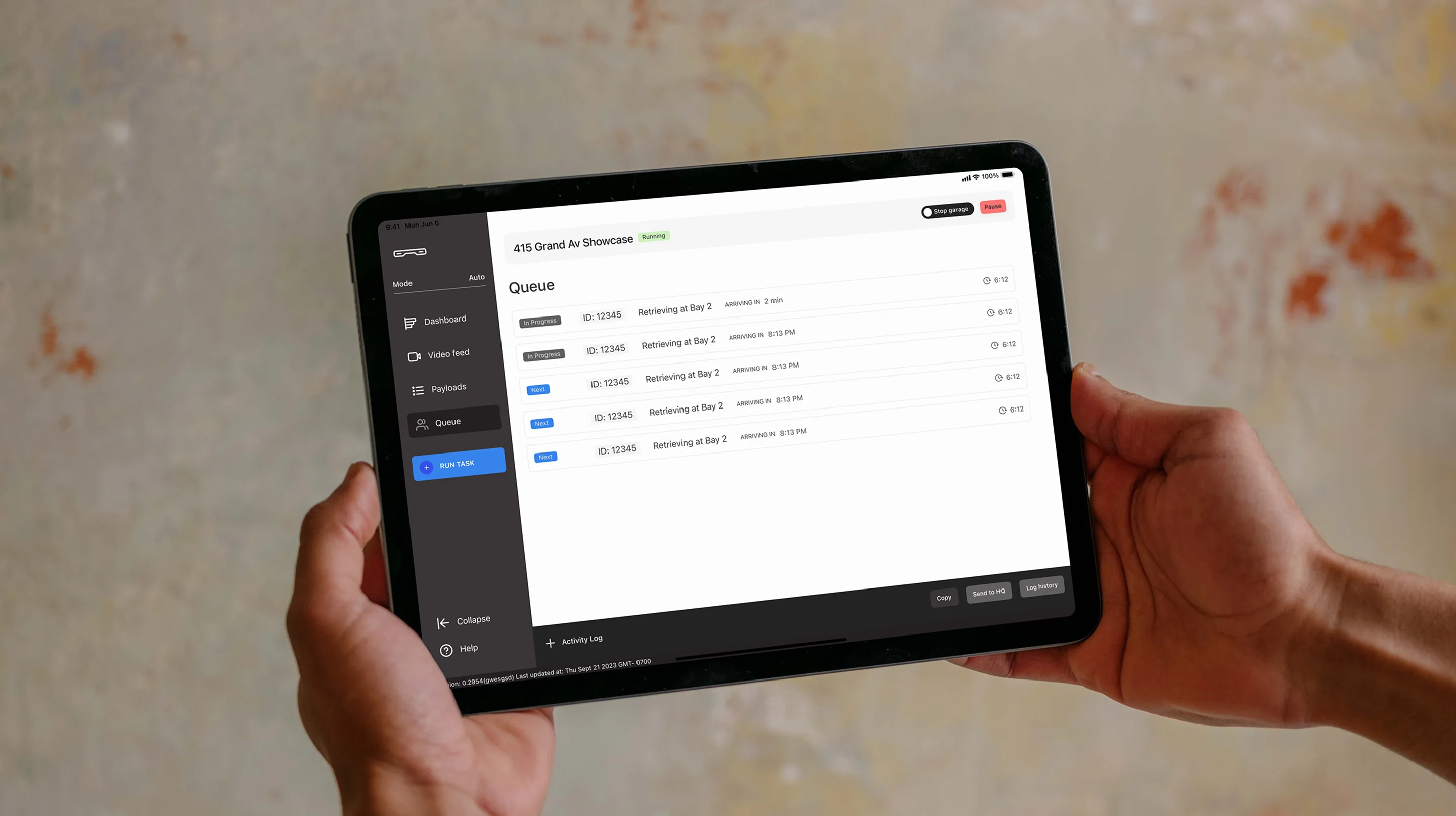
Designing for the stress case
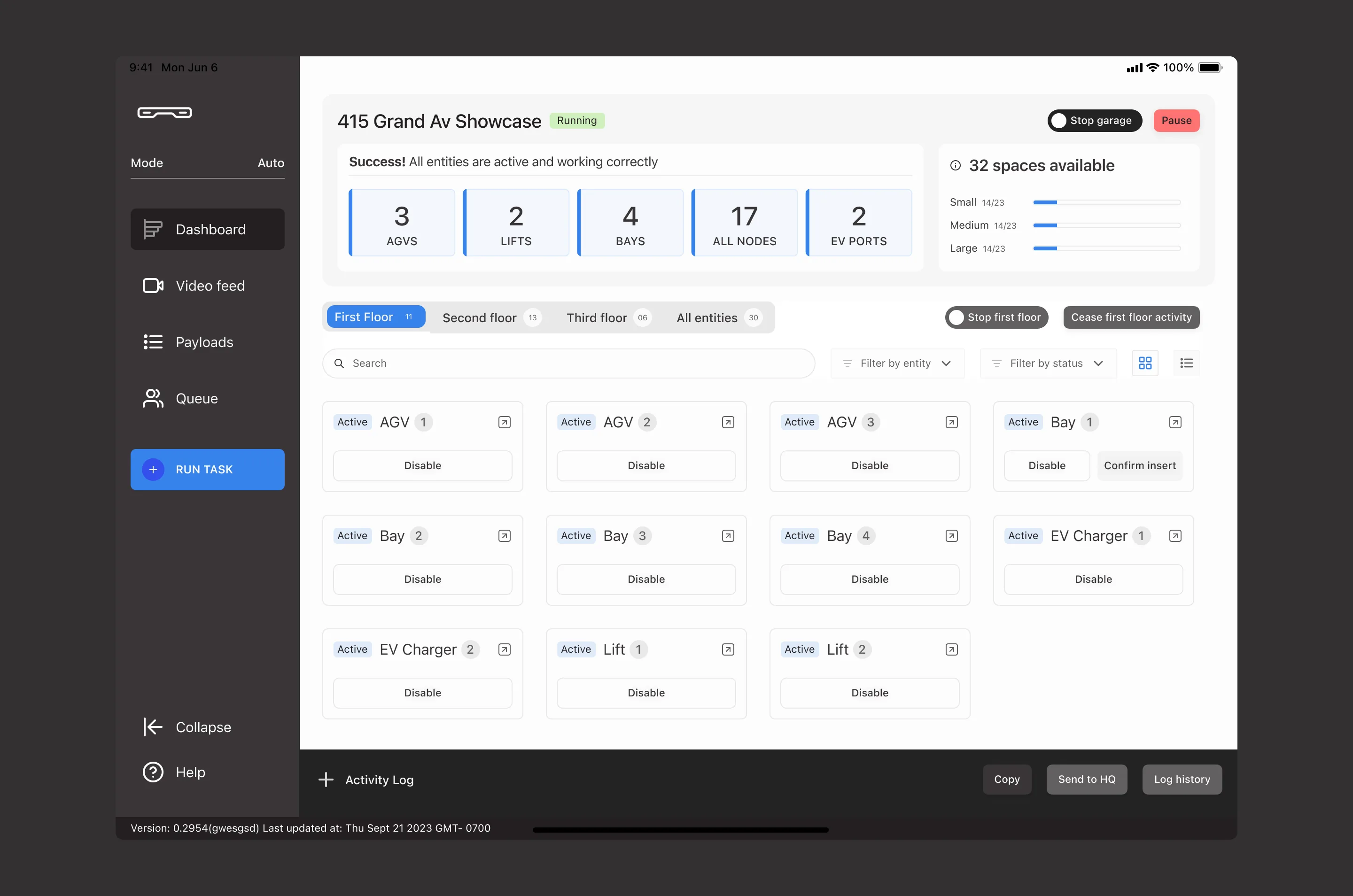
This was the hardest product. The dashboard needed to show real-time status of every robot and vehicle in the garage, surface errors instantly, and give attendants manual controls — without overwhelming non-technical staff.
I designed for the worst moment, not the average one. When a robot encounters an error and a line of cars is waiting, the attendant can’t be hunting through menus. The dashboard surfaces system health at a glance: one click expands the affected entity with the specific error and the available interventions.
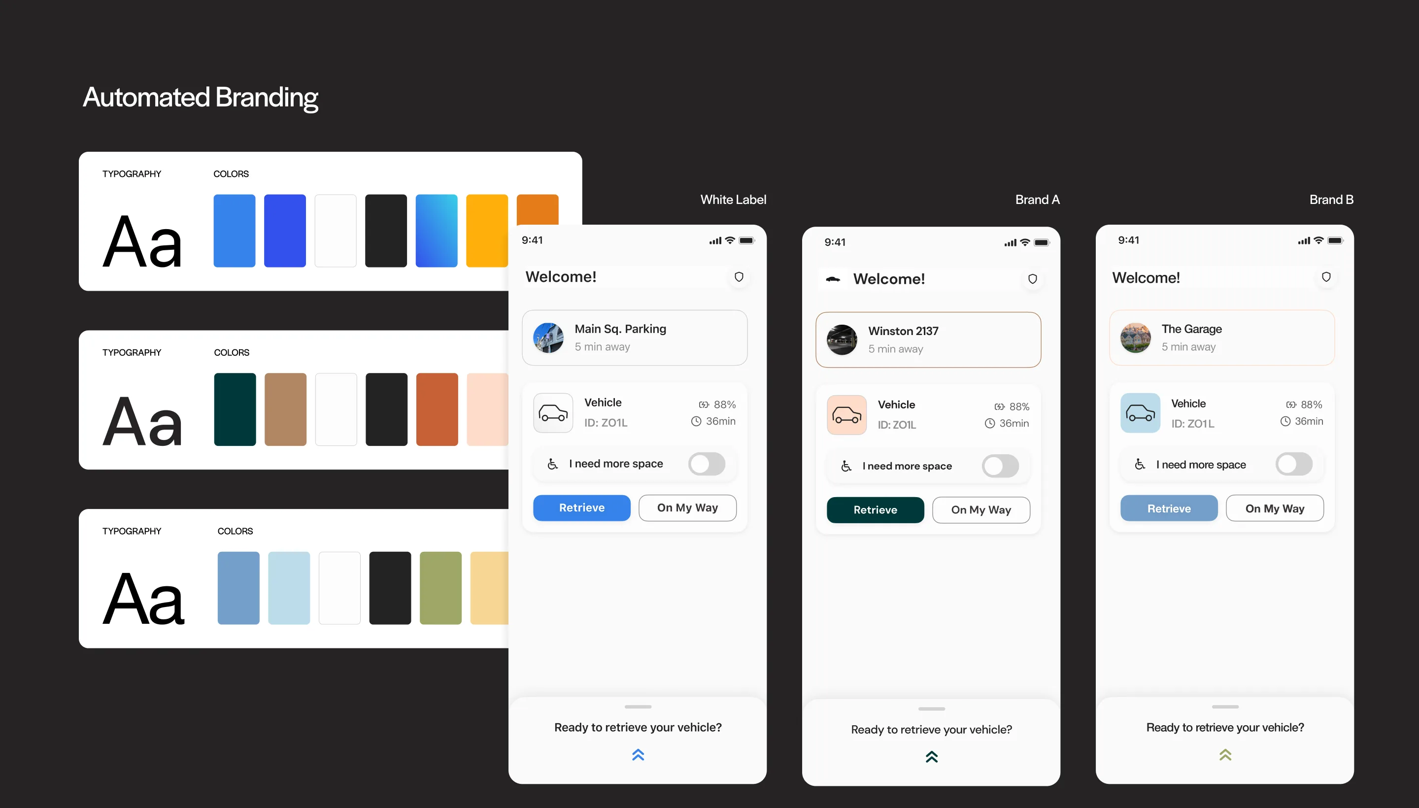
The architecture behind all three products
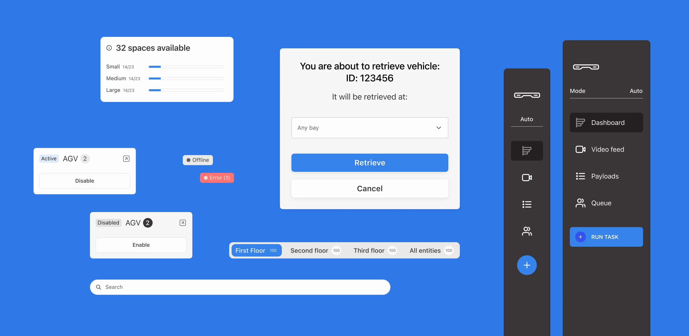
This is what made the project scalable. I built a connected Figma library where all three products pull from a single source of truth. Change the brand token file — colors, typography, logo — and every screen across the app, kiosk, and dashboard updates automatically.
Components and variants across the shared library
Before this system, preparing a branded suite for a new client took weeks of manual work. After: hours. The level of customization also went beyond what the sales team could achieve before — full typographic control, color theming, and logo placement propagating through the entire component hierarchy.
This wasn’t just a design efficiency win. It changed how Volley sold. Sales could now demo a prospect’s branded version of the product live in a meeting, not weeks after.
Outcome
Shipped a mobile app, kiosk interface, and operations dashboard with a connected Figma library system that reduced white-label deployment from weeks to hours, unlocking a level of brand customization the sales team couldn't achieve before.
Three products shipped as one connected system. The mobile app and kiosk give drivers a fast, reassuring experience regardless of which client’s garage they’re in. The dashboard gives operators real-time control without requiring technical expertise. And the library architecture turned white-label deployment from a weeks-long manual process into a same-day operation.
The biggest impact was commercial: Volley’s sales team could show prospects a fully branded product experience during a pitch — something that wasn’t possible before. White-label went from a feature they promised to a feature they could demonstrate on the spot.