The Well
A premium NYC wellness club whose digital experience didn't match the physical one. I reworked the gift-card flow that drove half of online revenue, and the member profile dashboard, alongside their PM and a developer.
The Well
Product Designer
2022
Product Design · UX/UI

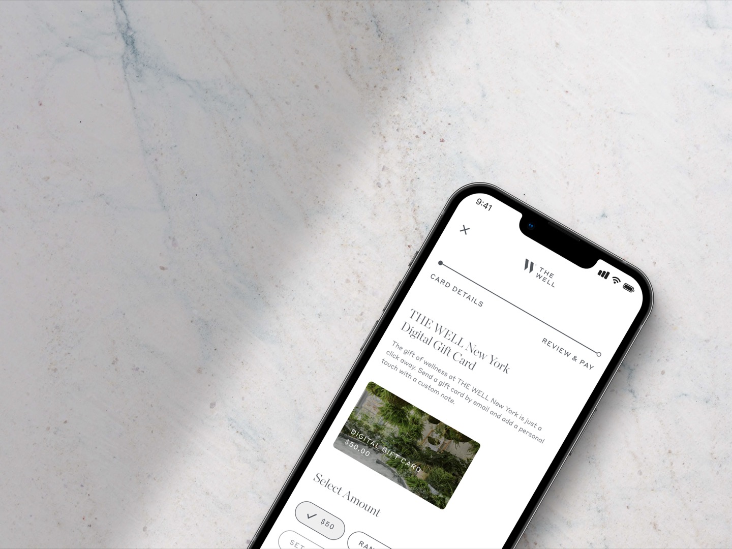
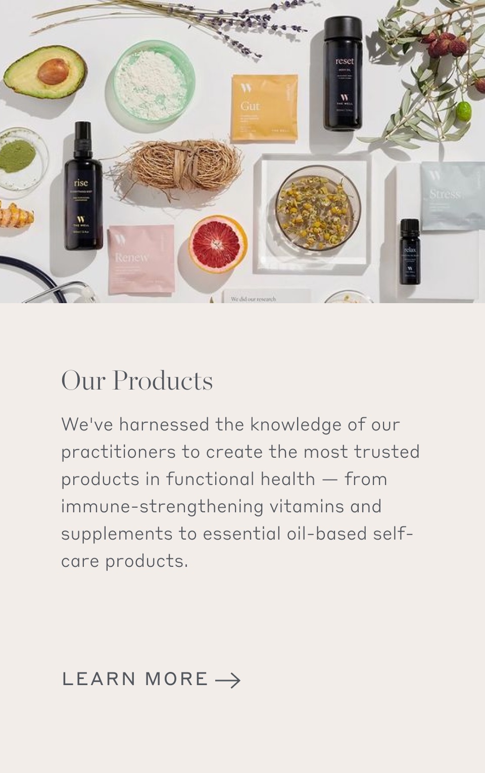
The Well is a membership wellness club for busy New York professionals, and half of its online revenue came from gift cards. But the flow that sold them worked against itself: people couldn’t tell digital from physical, couldn’t see what they were buying, and hit a review step that didn’t load. For a premium brand, the digital experience was quietly undercutting the physical one. I came in to fix the gift-card flow and the member profile, working alongside their PM and a developer who owned the projects.
A premium brand with a digital experience that didn’t match
The Well had a functioning platform, but two parts of it were holding the business back. Gift cards drove roughly half of online sales, yet the purchase flow lost people on the way to checkout. And the member experience, booking and profile, was functional but flat, nothing like the physical space it represented.
I was project-based here, not embedded. The PM and a developer already had both projects underway. I owned the design and worked in a tight loop with them, which meant my recommendations had to be specific enough to build, not just critique.
Critiquing the flow against what people actually wanted
I started with a UX teardown of the existing gift-card flow, structured around two things: what The Well needed (people completing purchases) and what the buyer needed (finding, buying, and redeeming a card without friction). Then I rated every issue by severity, separating hiccups that were nice-to-fix from findings that caused real confusion from blocks that stopped people completing the task at all.
That severity lens is what made the work actionable. With a small team and limited build time, the question wasn’t “what’s wrong” but “what do we fix first.” The blocks went to the top.
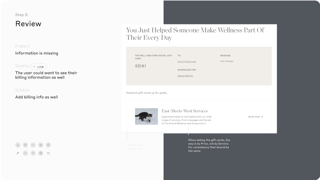

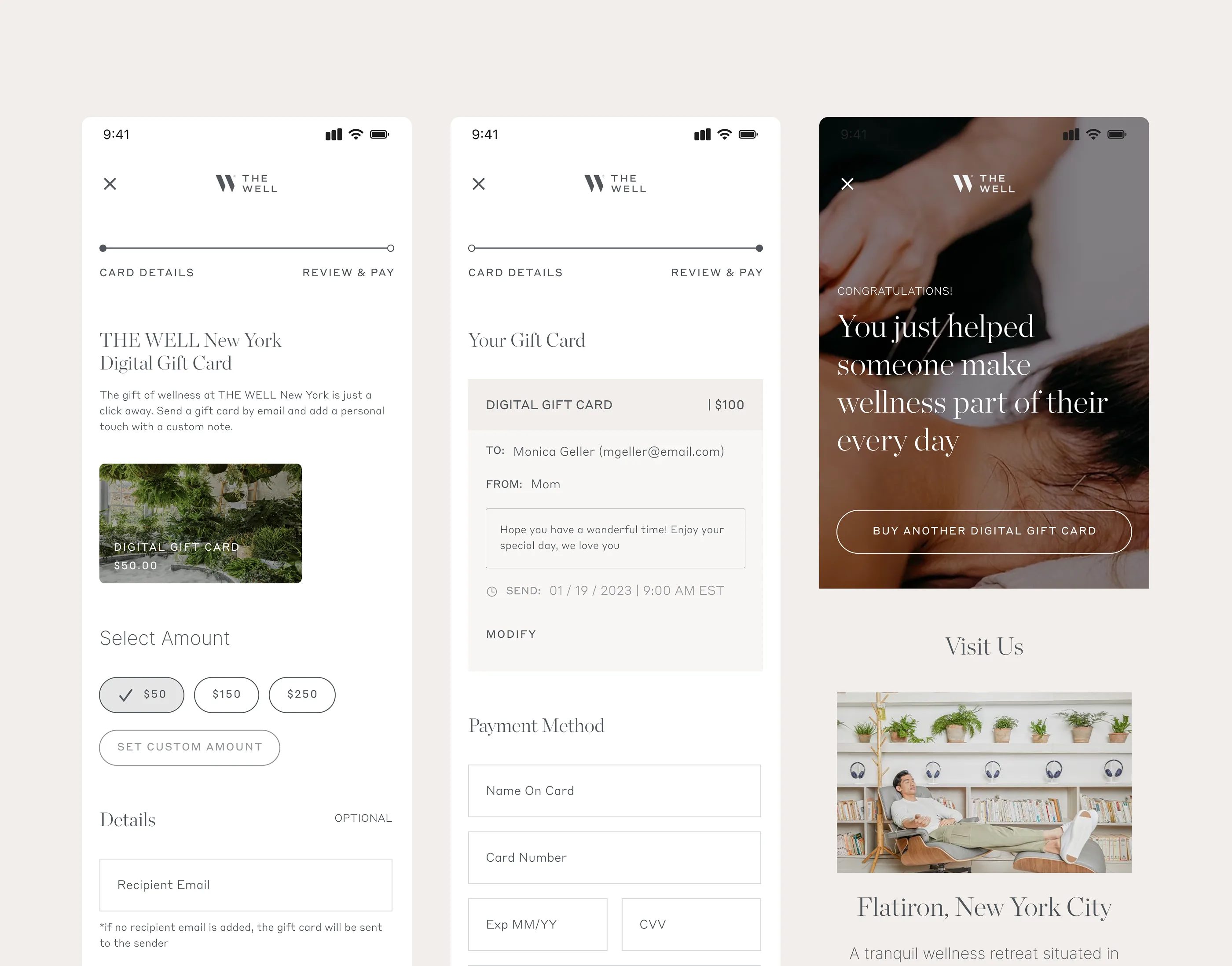
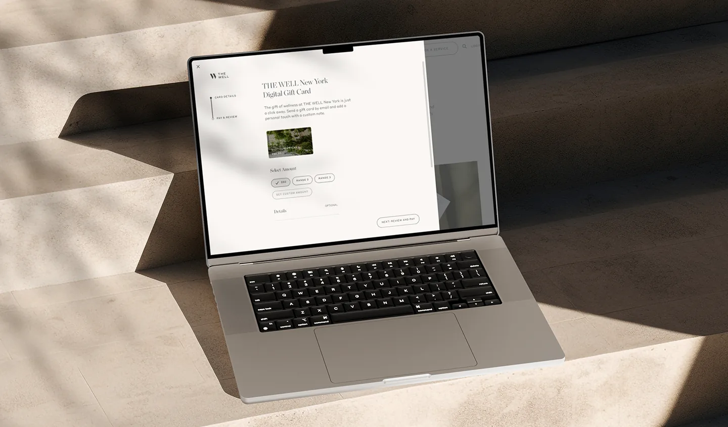
The block: a review step that didn’t load
The most damaging issue was the worst-hidden one. At the review step, the screen didn’t load properly, and buyers couldn’t see what information they were still missing. People got to the moment right before paying and stalled, with no way to tell what was wrong.
I treated this as the priority fix. The flow needed to break cleanly into steps where, by the time someone reached review, they could see everything they’d entered and everything still required, and edit it in place. The point right before payment is where you remove doubt, not introduce it.
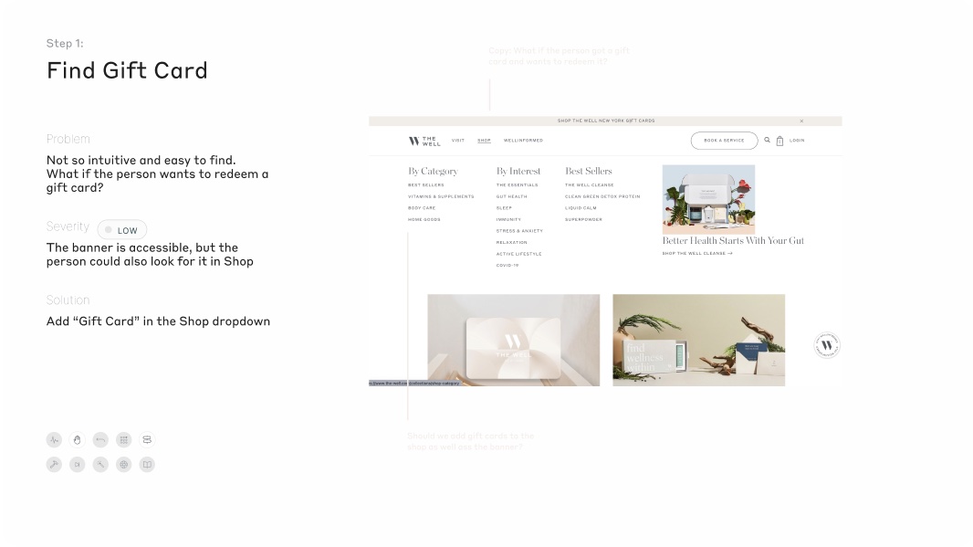
Make the gift card findable, and split digital from physical
Two findings sat upstream of the flow entirely. The gift card was hard to find in the first place, so I recommended surfacing it directly in the Shop navigation instead of leaving people to hunt. And the digital and physical cards shared the same treatment and call-to-action, so buyers couldn’t tell which one they were purchasing. Giving the digital card its own clear path removed a decision people didn’t know they were making. Redemption had the same gap: someone holding a card had no obvious way to use it, so that path needed to be explicit too.
Fewer steps, without losing what people typed
The existing flow had a tell: an exit warning that said you’d lose your progress and have to start over. That’s a band-aid on a flow that drops data and asks too much. Rather than guard the exit, I went after the cause. I explored the purchase as competing proposals, a longer multi-step version against tighter two- and three-step flows, to find how few steps the purchase actually needed. Shorter flow, progress that survives, less reason to abandon before paying.
Make it feel like a gift
A gift card is an emotional purchase, and the flow read as a cold transaction. I added customization, the card design, an editable message, recipient details, so the buyer feels the gesture rather than just filling a form. The confirmation does the same work: instead of a receipt, it tells the buyer “you just helped someone make wellness part of their every day.” The same moment, reframed from a transaction into the thing the buyer actually wanted to do.
Of The Well’s online revenue came from gift cards — the flow I rebuilt
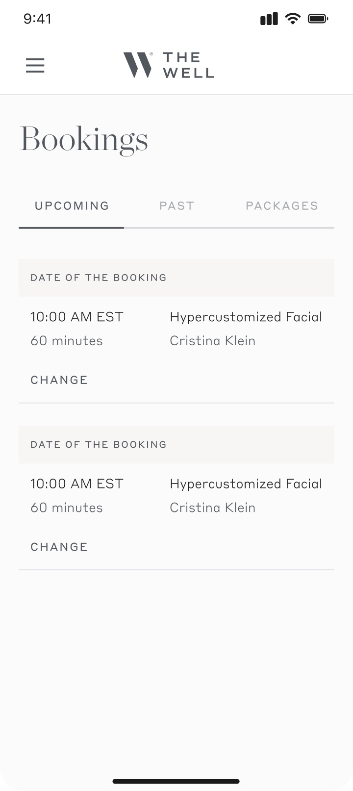
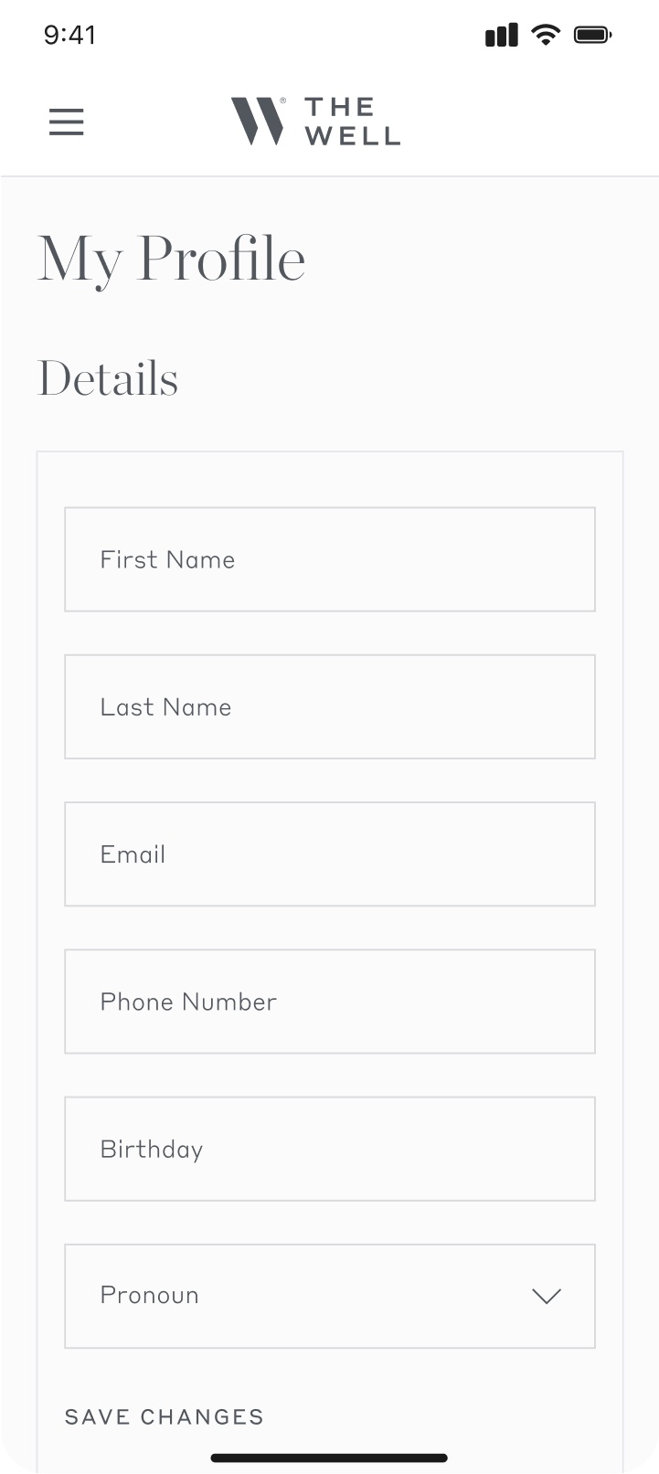
A profile that earns the membership
The second project was the member profile dashboard. It worked, but it gave members no reason to return to it. I designed it into a personalized hub: a welcome by name, a profile image, member status and renewal date, upcoming bookings and classes, and a place for member-only events and announcements. I designed a non-member version of the same surface too, so a logged-in guest sees a version that points them toward joining rather than a dead end.


Outcome
Rebuilt the gift-card flow that accounted for half of online revenue around the points where buyers got stuck, and gave members a personalized profile dashboard that matched the brand.
I rebuilt the gift-card flow around the exact points where buyers were getting stuck: the review step that didn’t load, the digital-versus-physical confusion, the gift card that was hard to find, and a checkout long enough to lose people before paying. For a flow that carried half of online revenue, the fixes were aimed where the money was leaking. The member dashboard turned a flat profile page into a reason to come back. I worked the whole engagement in a tight loop with The Well’s PM and developer, so the recommendations shipped as builds rather than slides.