TDP Rebrand
End-to-end rebrand for a design agency, from values alignment and visual identity through to a fully redesigned website.
The Design Project
Product Designer
2023
Branding · Design Systems · Web Design
The Design Project had grown from a small team into a globally distributed design agency, but the brand hadn’t kept pace. The visual identity felt disconnected from how the team actually worked: collaborative, curious, and craft-driven. We needed to realign the brand from the inside out.
Every small detail had a reason that ties back to our mission and values. — Dianne Alter, Co-founder
A brand that hadn’t grown with the team
TDP had evolved from a small studio into a distributed agency with designers across multiple time zones. But the visual identity still reflected the early days — inconsistent touchpoints, no shared design language, and a website that didn’t communicate what working with TDP actually looked like. The gap between how the team worked and how the brand presented itself was growing.
Full rebrand, start to finish
I worked across the entire rebrand: collaborative workshops to define values, brand strategy, visual identity development, and the website redesign from wireframes through high-fidelity prototypes.
Relationships as the foundation
We started with internal workshops to surface what TDP actually stood for. Through exercises mapping values like customer obsession, bias for action, and transparency, the team landed on “relationships” as the core of everything. The logo concept emerged directly from this — the mark itself represents connection.
Market research and benchmarking against peer agencies helped us understand where TDP fit and where it could differentiate. We interviewed both designers and non-designers to pressure-test messaging clarity.
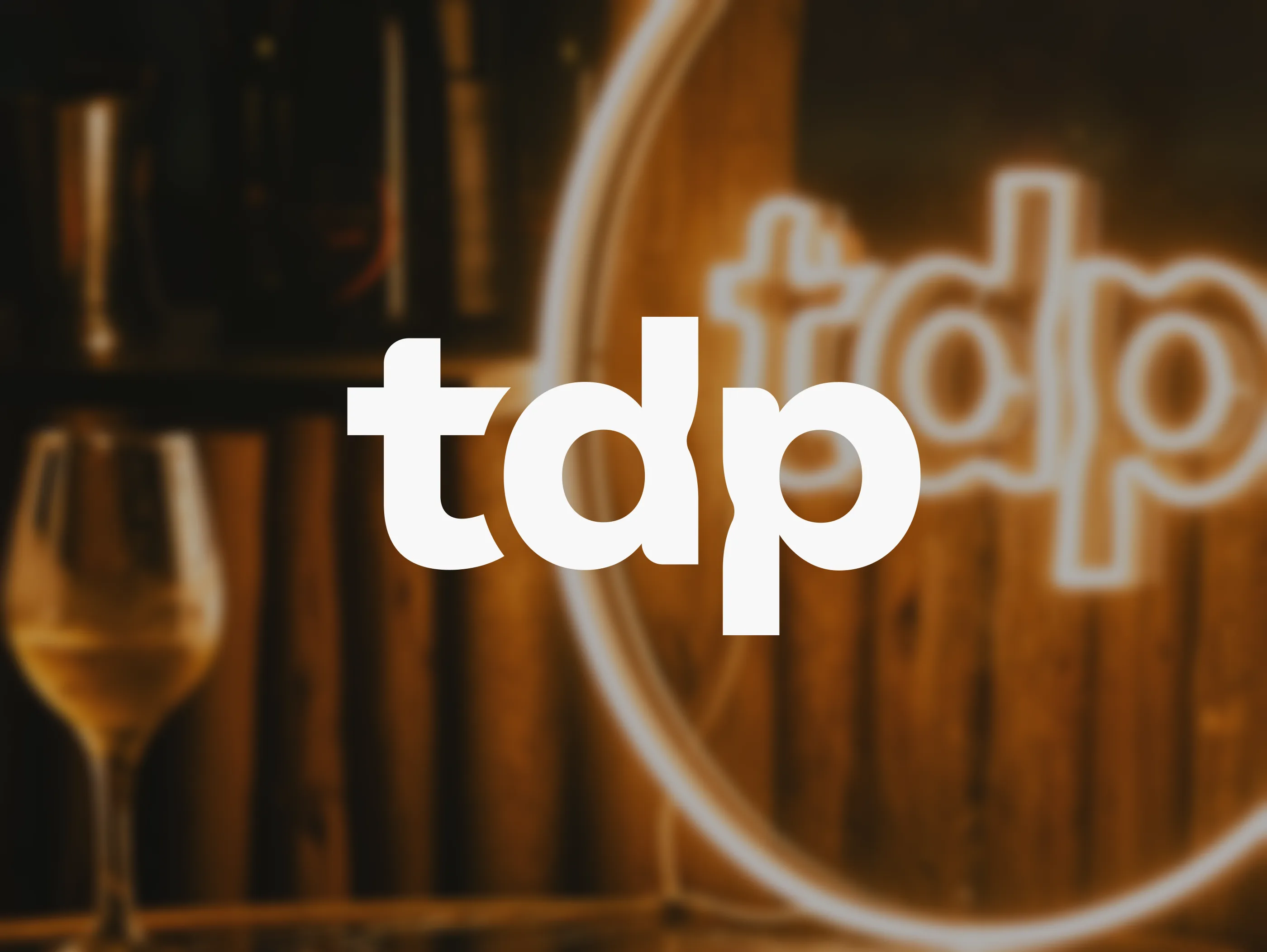
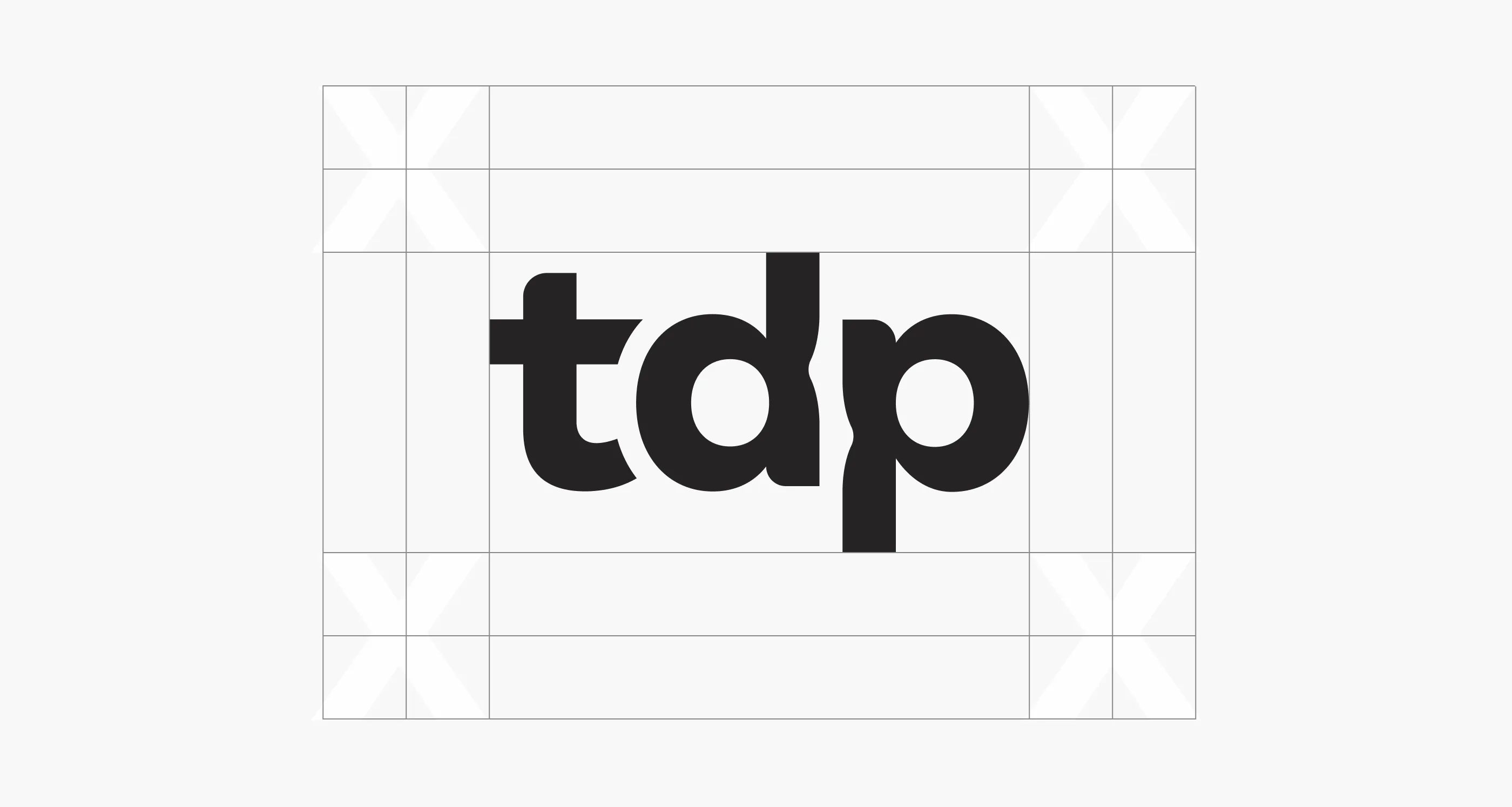
The mark
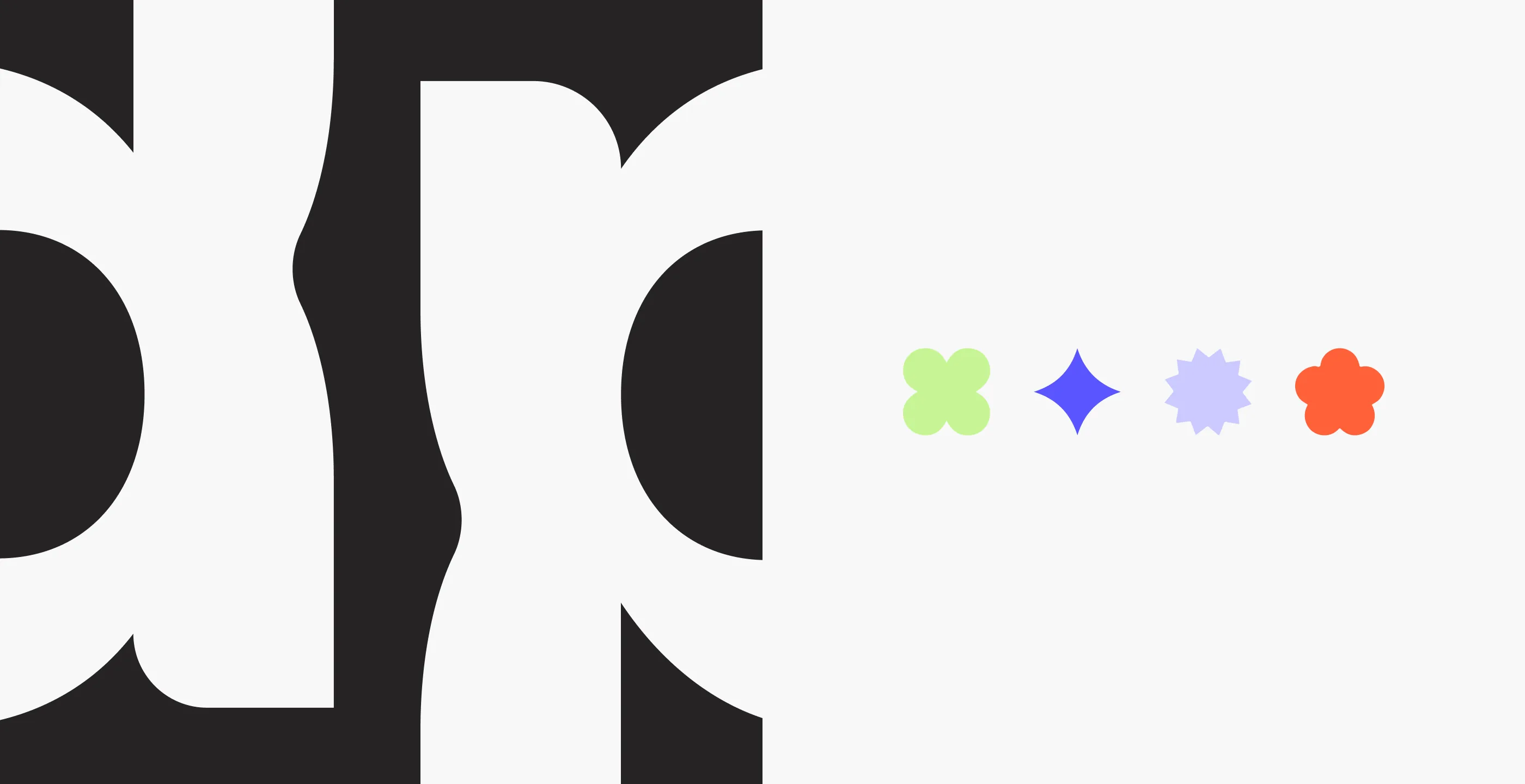
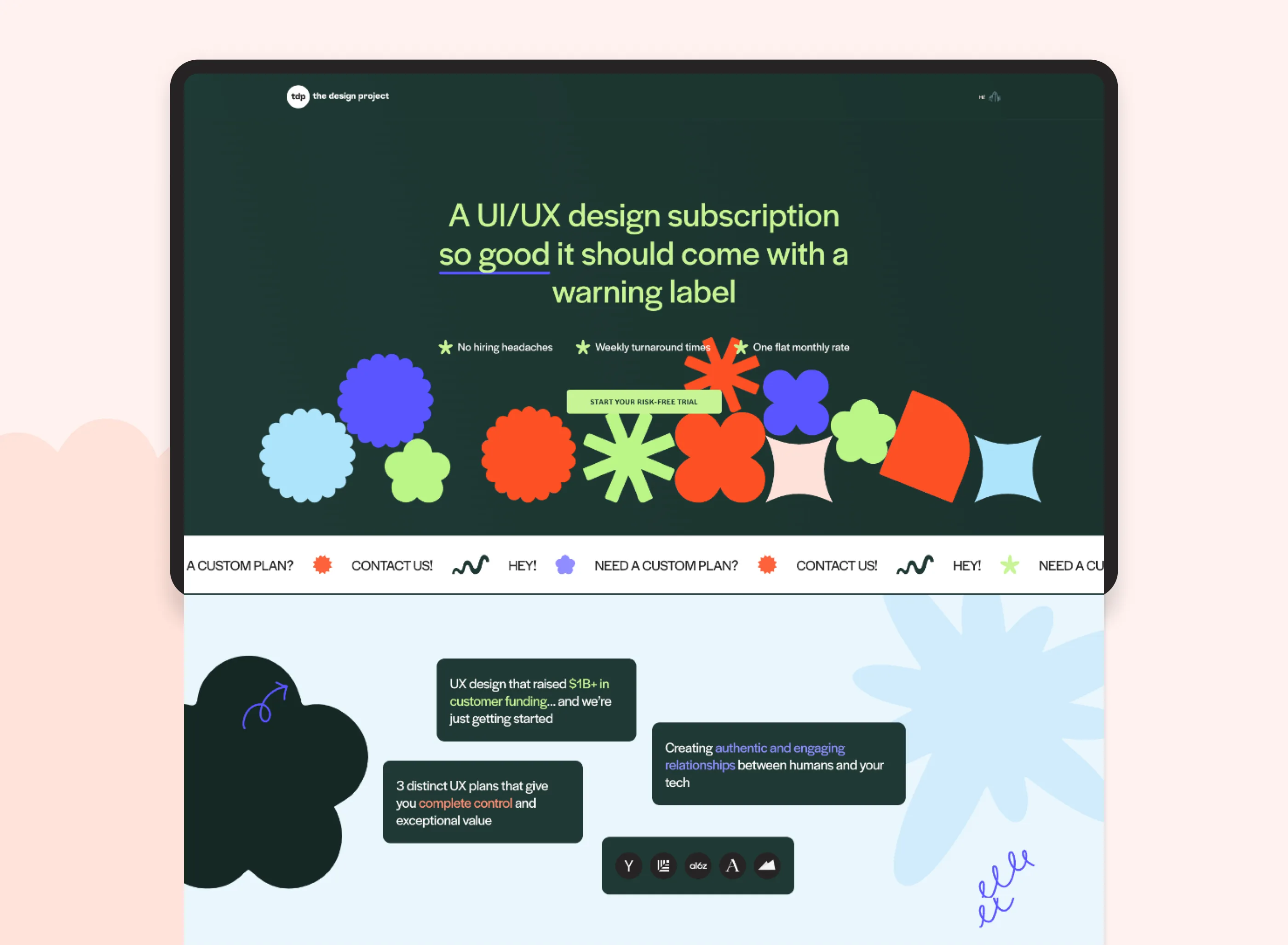
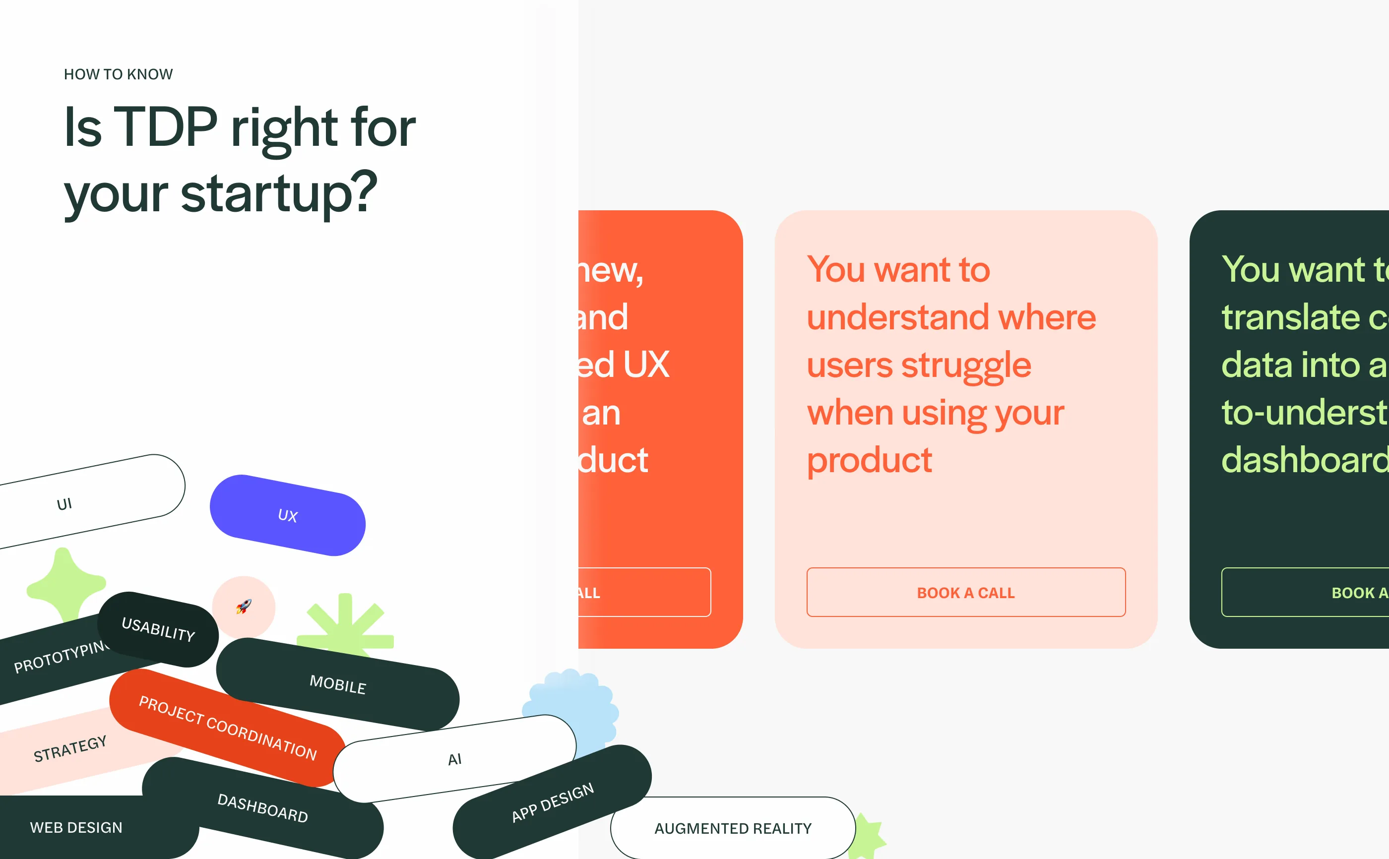
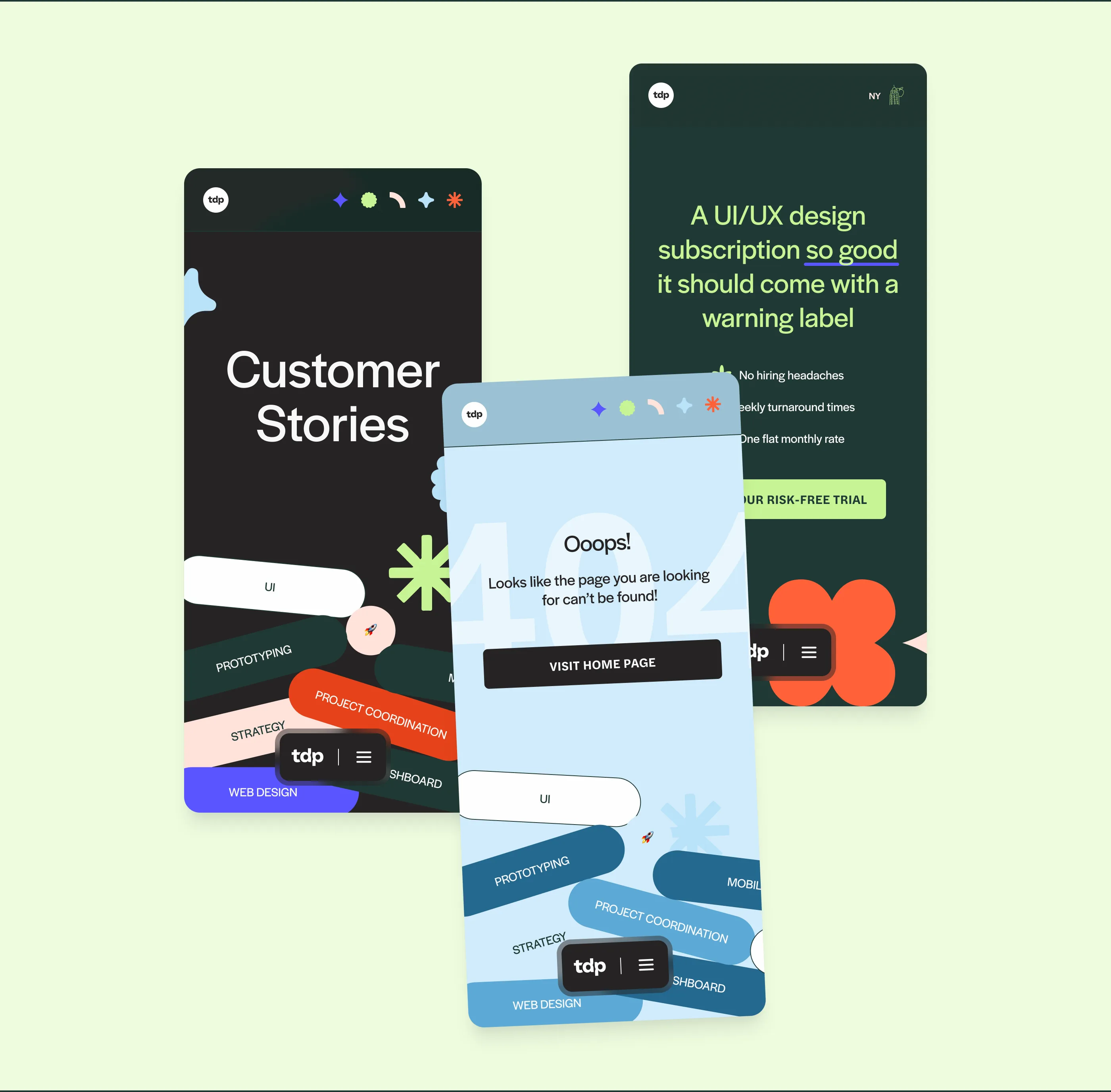
The wordmark is compact and confident — tdp in lowercase, set in a typeface that balances technical precision with approachability. The construction is deliberate: proportions defined on a grid, giving the mark rules that any designer on the team could apply consistently. Paired with a set of organic decorative shapes — clover, star, starburst, flower — the identity has a flexible expressive layer that brings personality to layouts without needing custom illustration for every application.
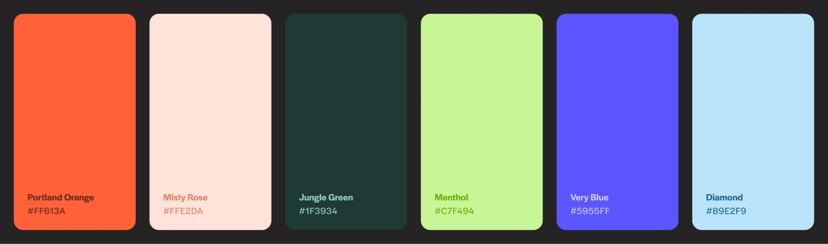
Color system
Six colors across a full palette range: Portland Orange as the primary accent, Jungle Green for depth, Misty Rose and Menthol for warmth and lightness, Very Blue and Diamond for range. The palette is energetic without being aggressive — fun but professional. Rich enough for marketing to feel vibrant while the product stays focused.
Typography & voice
Halyard Display and Halyard Text. Warm enough to feel approachable, structured enough to signal expertise. We also shifted the copy register from generic agency-speak to a more direct, human tone — every piece of copy was tested against the values framework. “A UI/UX design subscription so good it should come with a warning label” is the kind of headline that only lands when the brand has the confidence to back it.
Redesigning the conversion path
The redesign moved from a portfolio-heavy structure to a service-first hierarchy. The hero communicates the value proposition immediately, and every subsequent section earns the scroll. Wireframes went through multiple rounds of testing with both internal team and external users before anything was built.
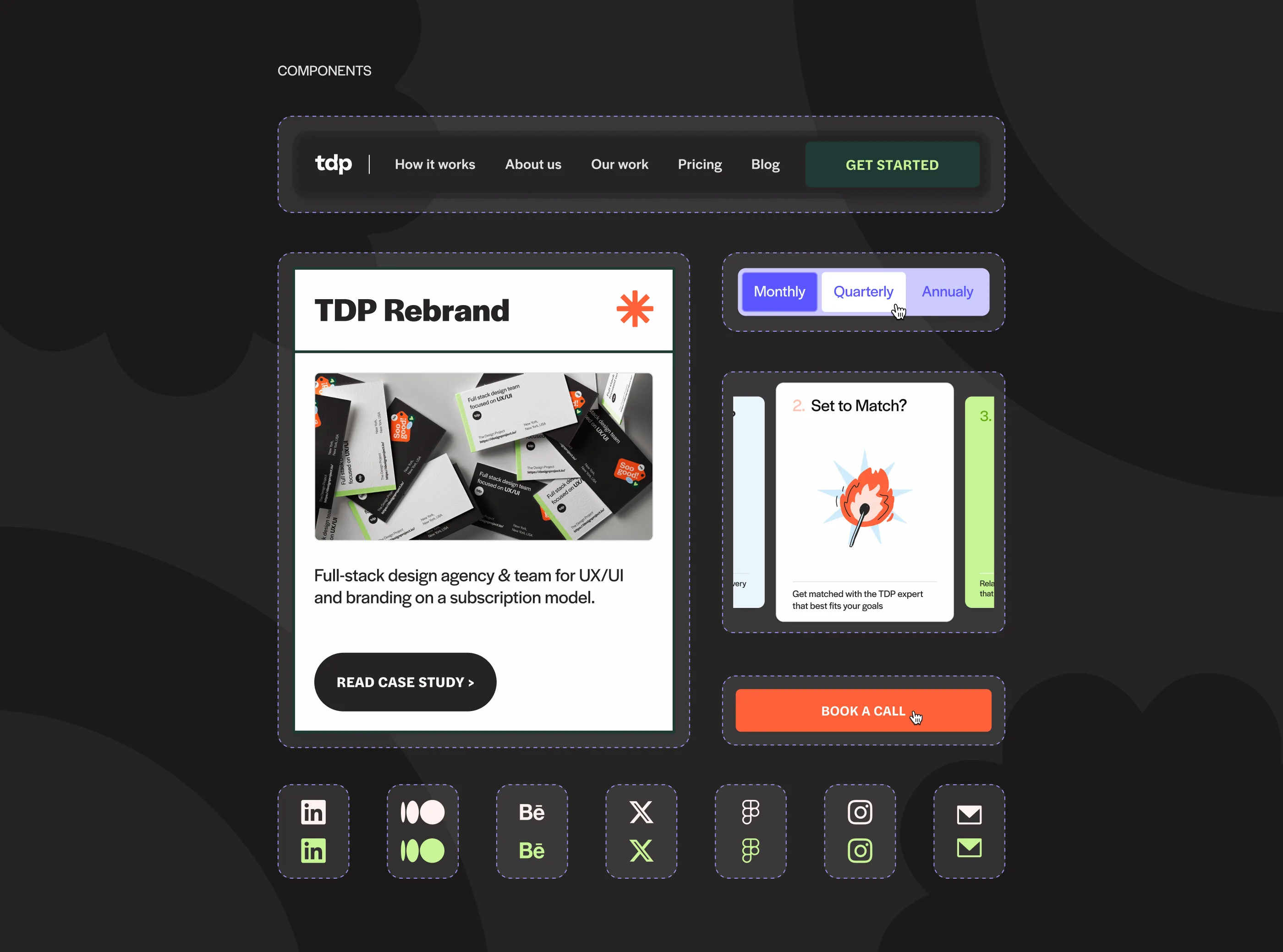
Design system & components
The website was built on a component library that covered navigation, case study cards, pricing toggles, CTAs, and social elements. Everything had a dark variant and a light variant, ensuring the brand system could flex across the full site without every screen feeling the same.
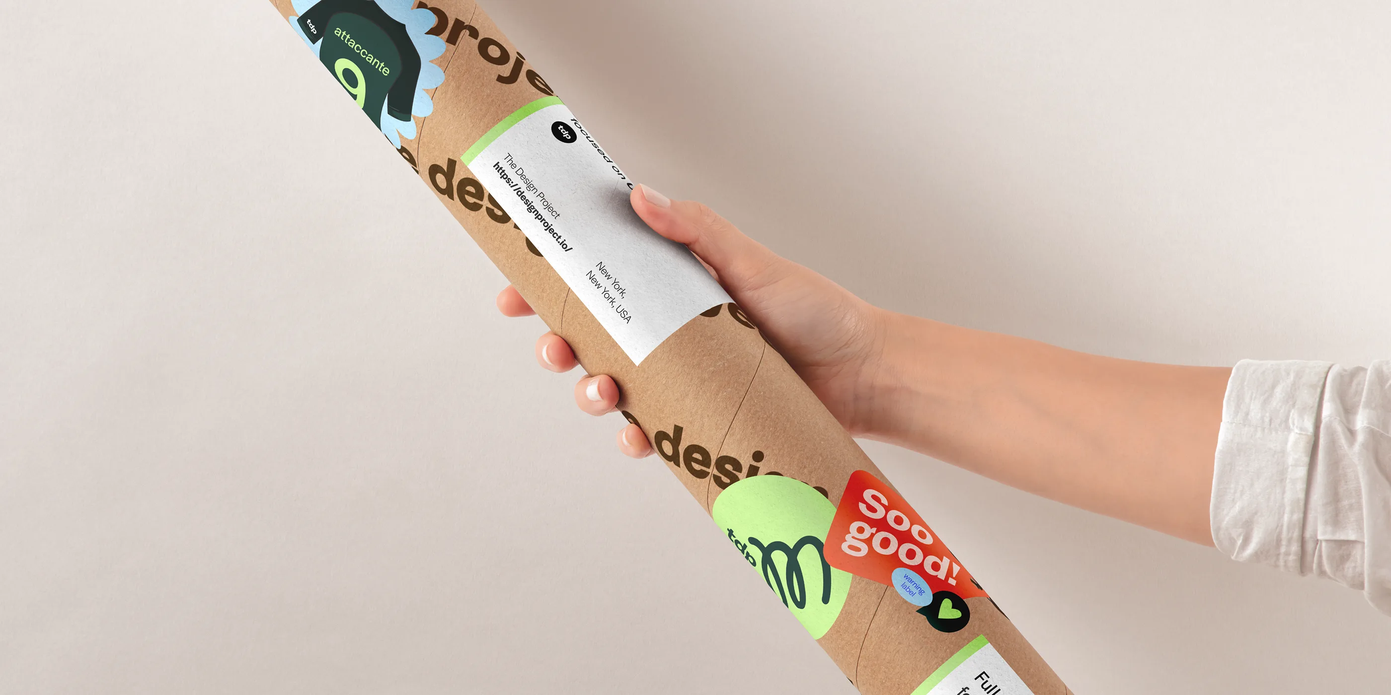
Brand in the world
The identity extends beyond screens. Branded packaging — mailing tubes covered in TDP stickers — gave the team physical artifacts that matched the digital experience. For a distributed agency that works remotely, these touchpoints matter.
Startups advised by the TDP team — the experience behind the brand
Outcome
A cohesive brand system that aligned the entire team around a shared identity, reflected in every touchpoint from the website to client communications.
The rebrand unified how TDP presents itself across every channel — from the website to client communications to social media. The team finally had a shared visual language that reflected how they actually work: collaborative, curious, and craft-driven. The component library gave developers and designers a single source of truth, and the identity system was flexible enough that marketing could run with it without breaking consistency.