Avataar
Dark mode redesign and UI overhaul for the world's first AI-led computer vision platform for spatial storytelling and interactive 3D experiences.
Avataar
Product Designer
2022-2023
Product Design · AR
Avataar is a SaaS platform that uses AI-driven computer vision to enable interactive spatial storytelling: 3D product experiences, augmented reality, and immersive content creation for brands. I redesigned the full UI, transforming the platform from a dated light mode interface into the dark, professional-grade tool its technology deserved.
The platform needed a dark, modern aesthetic. For tools that involve 3D manipulation, color correction, and visual editing, a dark interface isn’t just preference — it’s functional.
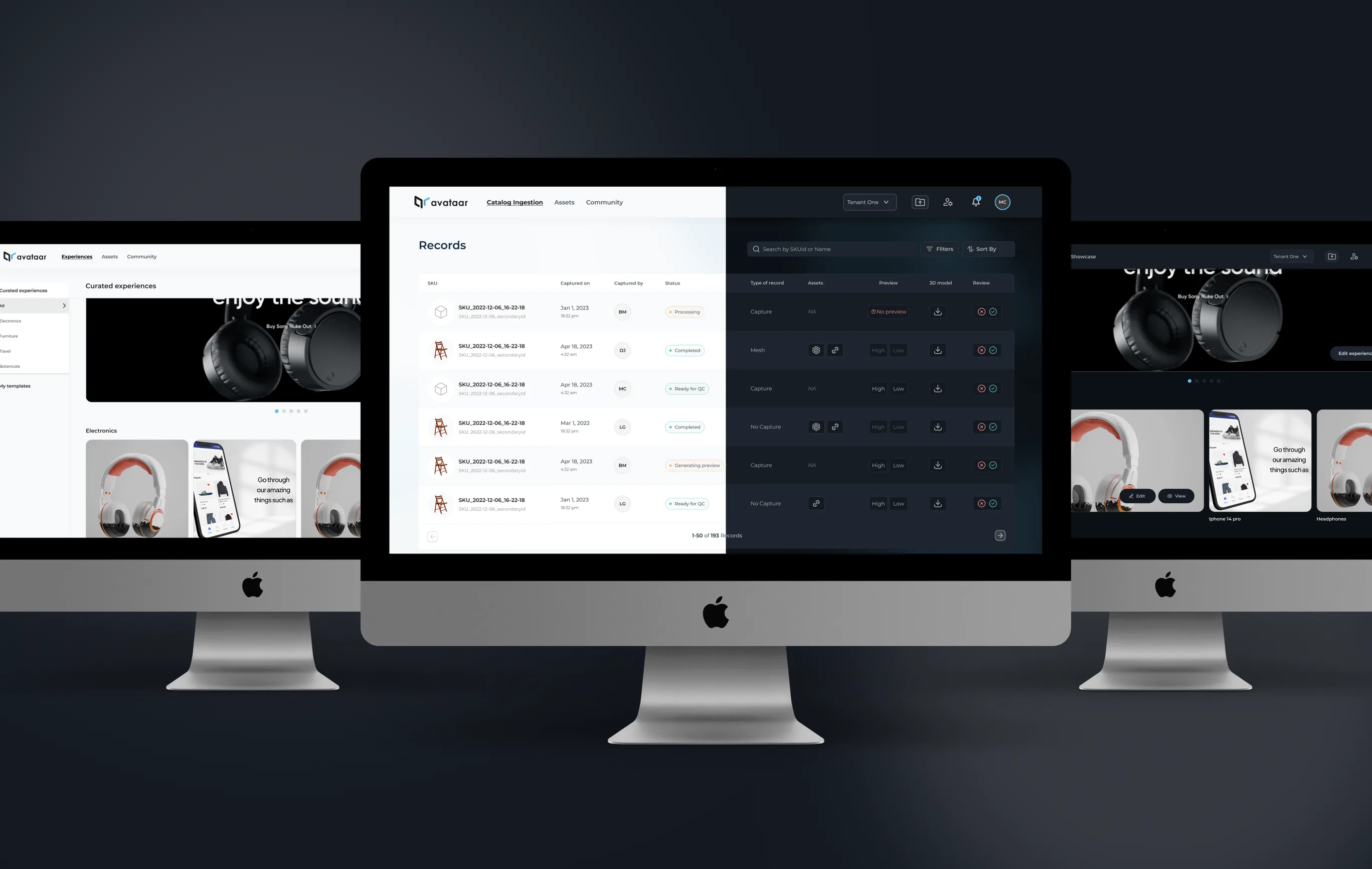
Three products, one dark mode system
The Avataar platform spans a catalog management system, an experiences editor, and a records dashboard. All three needed the dark mode transformation while maintaining consistent interaction patterns.
A visual identity that didn’t match the technology
User feedback was consistent: the platform needed a dark, modern aesthetic. For tools that involve 3D manipulation, color correction, and visual editing, a dark interface isn’t just preference; it’s functional. Dark backgrounds make 3D content pop, reduce eye strain during extended sessions, and signal professional-grade tooling.
The existing light mode interface, while functional, read as generic. The UI didn’t differentiate Avataar from any other SaaS dashboard, let alone communicate “world’s first AI-led computer vision platform.”
Dark mode foundation
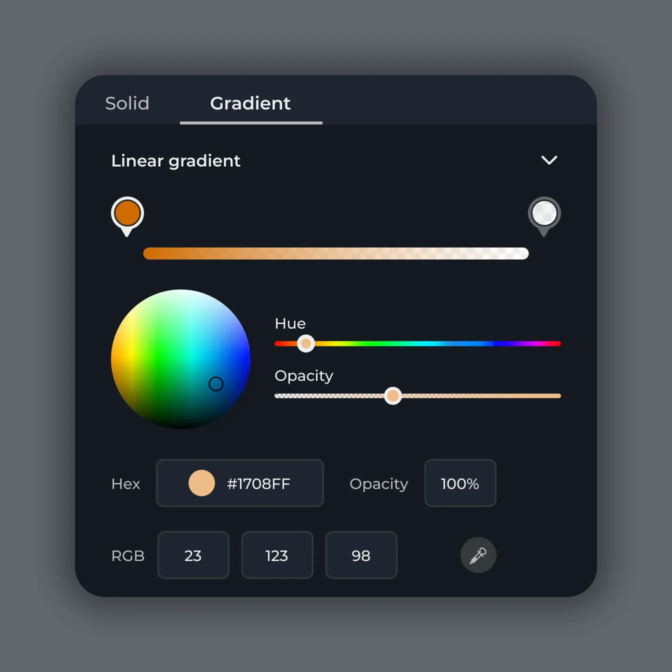
Built the new palette from the original light mode colors, translating them into a dark context. Primary cyan (#60BCEA) against near-black (#0B1015) created the tech-forward feel users expected. Every color was tested for contrast compliance and perceptual clarity against dark surfaces.
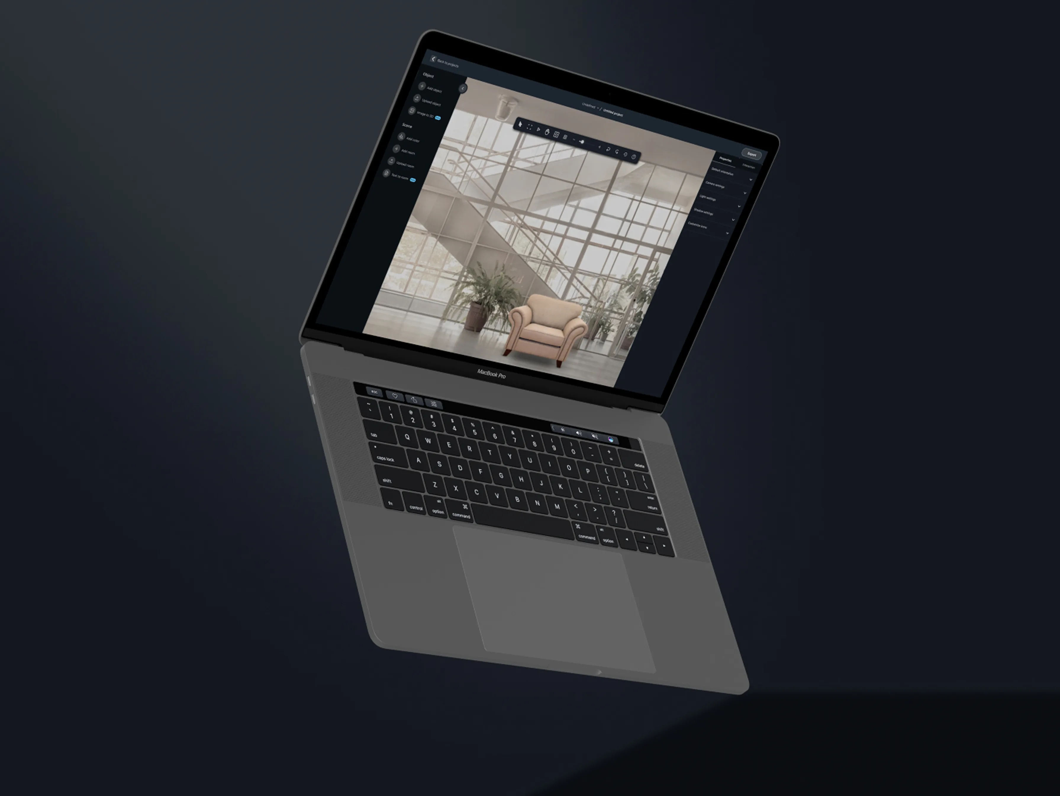
Editor workspace
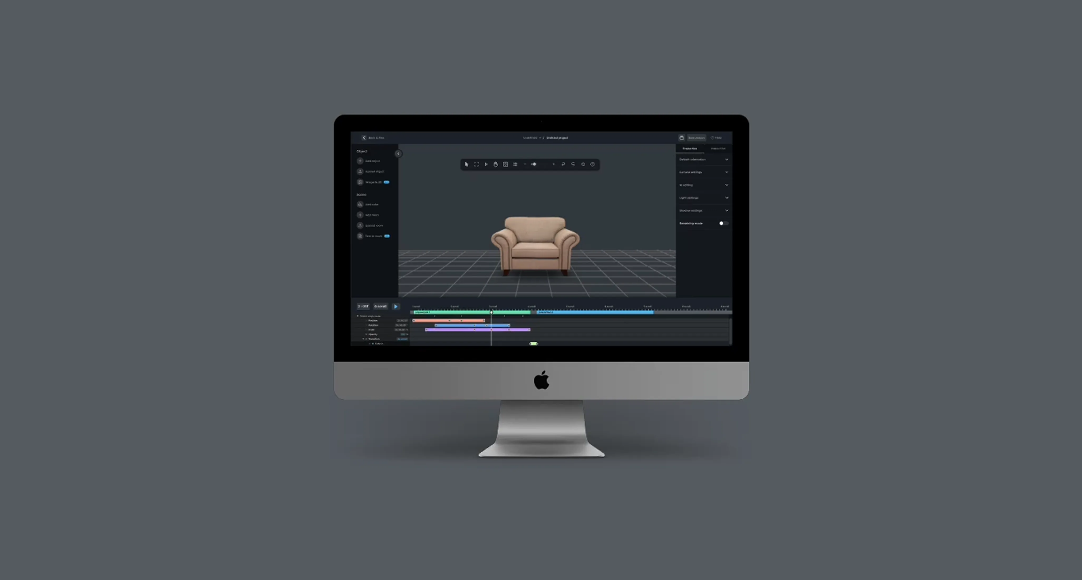
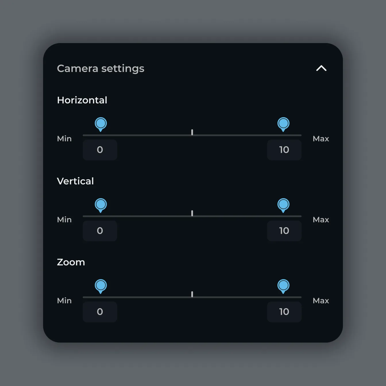
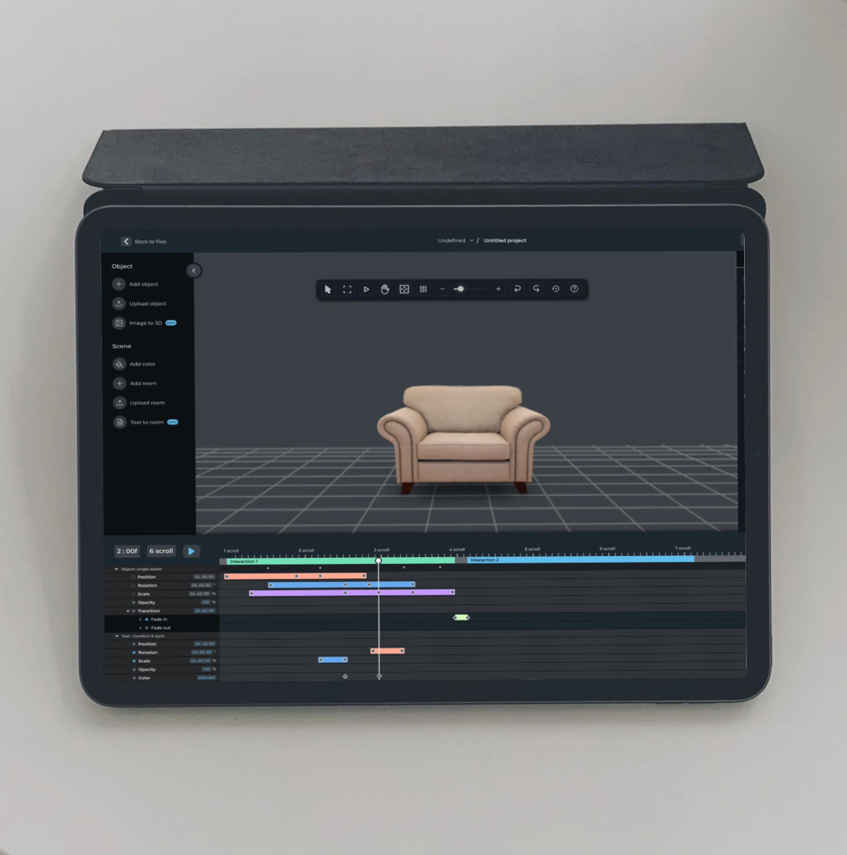
Redesigned the core editing experience, where users manipulate 3D objects, adjust cameras, and apply effects. The workspace needed to feel spatial itself, with clear tool groupings and minimal visual noise competing with the 3D canvas.
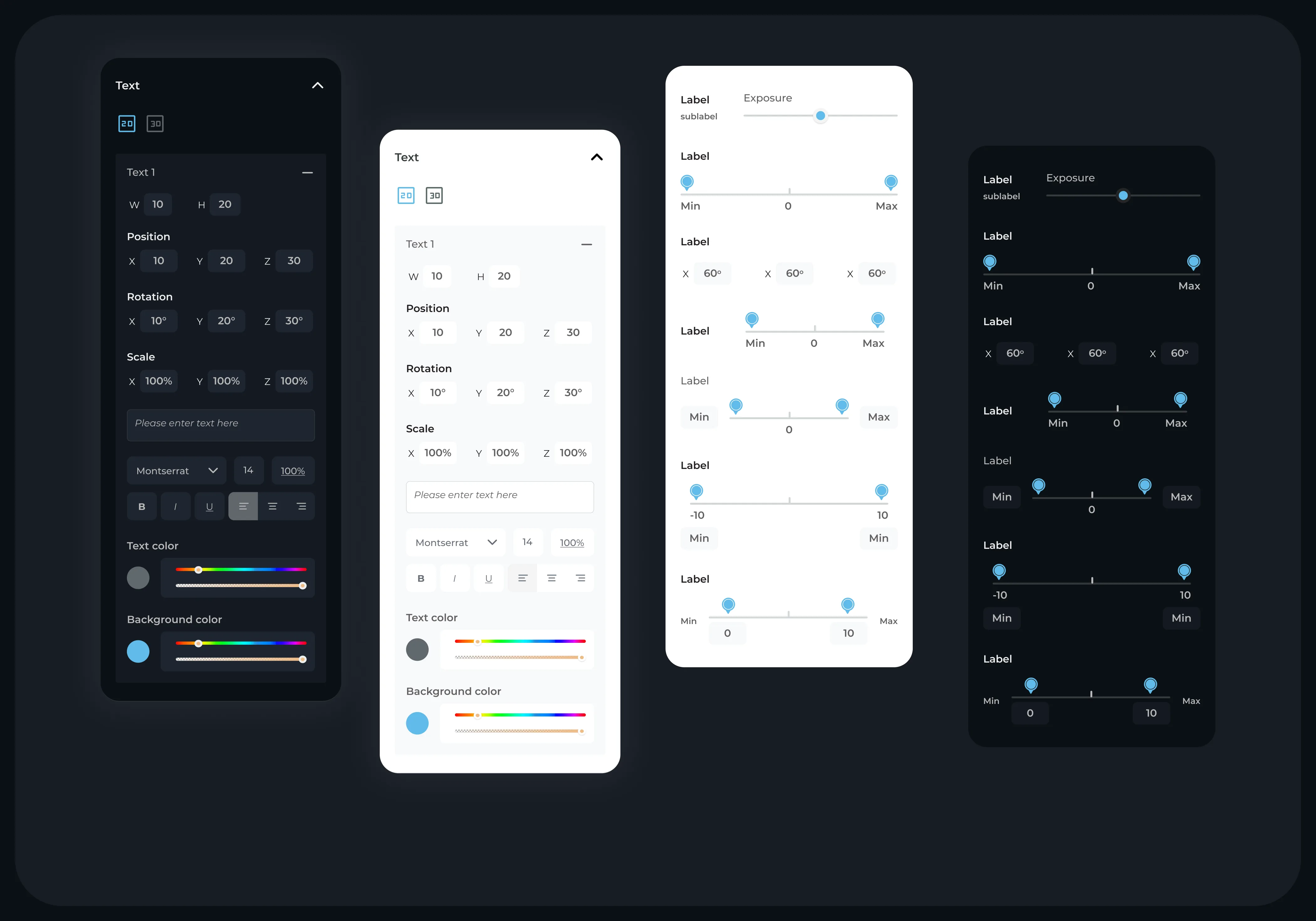
Tools and filters
Six filter variations, each with consistent interaction patterns. The filter UI needed to be powerful enough for advanced users but scannable enough for newcomers exploring the platform.
Navigation
Restructured to prioritize the creative workflow. Quick access to projects, assets, and settings without cluttering the editing environment. The sidebar panels support both expanded and collapsed states, with clear section groupings for Object, Scene, and Properties.
Products redesigned with a unified dark mode system
Outcome
Transformed the platform's visual identity from dated to modern, meeting user expectations for a cutting-edge spatial computing product.
The redesign gave Avataar the visual identity its technology deserved. The dark mode transformation wasn’t cosmetic. It fundamentally improved how users interacted with 3D content, making the platform feel like the professional spatial computing tool it is.